David Berman Communications
David Berman will help you repeat your successes

COVID-19 UPDATE

Posted on

COVID-19 UPDATE | All safe: expect the usual responsiveness you rely upon

We are still operational, following the direction of the authorities, which, of course, is evolving daily as we follow the requests of our government’s Medical Officer of Health. With public health being the primary concern, we have dutifully moved the majority of our team to working from home. While we’re in this mode, you can expect our usual responsiveness you rely upon. We continue to be available via all the usual channels, with no deadlines or other commitments at risk.

Return to top

Reviewed March 31, 2020

Happy Global Accessibility Awareness Day 2019! Now releasing our accessibility ribbon for Microsoft Word in Danish

Posted on

(Berman Tilgængelighedsbånd til Word)
(伯曼微软Word无障碍辅助功能界面)
(Instructions françaises pour l’installation du ruban)

Another ribbon-cutting for Global Accessibility Awareness Day 2019!

Once again, we’re celebrating GAAD by releasing a new version of the Berman Accessibility Ribbon for Word. Last year, we asked you to vote on the language we should translate the ribbon to next. Based on the results of that survey, we present to you… the Berman Accessibility Ribbon for Word in Danish! And so Danish joins English, French, and Simplified Chinese already in our collection. And we plan to be releasing two more languages later this GAAD Month!

If you’re already using our ribbon, I hope you’re finding it useful: you can update to the latest English Accessibility Ribbon for Word by following the ribbon installation instructions.

New to the ribbon? In Microsoft Word, a ribbon is a bar that organizes Word’s features into a series of tabs at the top of a document. We’ve created one, called the Berman Accessibility Ribbon, that helps make your documents accessible. It’s an add-on to Microsoft Word for Windows (versions 2010, 2013, and 2016, 2019, and 365).

Install the Berman Accessibility Ribbon into your Microsoft Word to make it easier to create and maintain accessible Word files that benefit everyone. The ribbon will help you create documents that are accessible for everyone and that comply with W3C’s WCAG 2.0 and 2.1 criteria, as well as PDF/UA (these are the criteria that regulations such as ADA, Revised Section 508, EU’s Web Accessibility Directive, and AODA point to).

And today is our ribbon-cutting launch of the Danish Accessibility Ribbon for Word.

The add-ons are free donationware: if you choose to donate, you’ll be supporting accessibility initiatives (the Danish ribbon supports Carleton University’s READ Initiative). Many thanks to Emil Jonathan Wittendorff from Diversa in Copenhagen, for their help with the Danish ribbon!

Screen capture of Danish version of Berman Accessibility Ribbon for Microsoft Word 2016

And we’ll be releasing ribbons in Arabic and Hebrew soon!

Get your ribbons here: http://www.davidberman.com/ribbon


Return to top

Reviewed May 16, 2019

How to Decide Between PDF vs. HTML for a Online Form

Posted on

If you find yourself having to decide between PDF vs. HTML for an online form… here’s some guidance to help you decide which path to take on a case-by-case basis.
Keep in mind that it’s totally fine to go one way on one form and another on the next, if need be. Of course in a perfect world every form would be available in any format. However when you need to be pragmatic… (in no particular order).

Choose PDF when…

  • the audience prefers PDF
  • it is easier for you to provide PDF in a format that includes everyone
  • people will want to Save As a copy locally, for their own reference
  • people will want to Save As a copy locally, for potentially future reuse (e.g. annually)
  • people will want to have the option of wet-filling (i.e with a pen, not a computer) all or part of the form
  • people will want to potentially print it out semi-filled to discuss with someone else before it gets sent
  • people will find it easier to fill the form if it looks more the printed copy they are familiar with from the past
  • the user and/or the person processing the form will be more comfortable with the graphic cliche of it looking more like a conventional form
  • regulations demand that the form have a presentation of a certain look (e.g. the tax code, or use of an existing form from a third-part insurance industry standard)
  • there is communications strategy value in the form having a locked-out graphic design consistency that cannot be altered by others
  • there is potential benefit in using any of Adobe’s workflow benefits for sending, tracking, capturing, and/or aggregating the data

Choose HTML when…

  • the audience prefers HTML
  • convenience for the audience (nothing to download, no reader to launch, potentially autofilled by browser or browser add-on, easier submission of the form, potentially partially autofilled from their “account” within an extranet)
  • it is easier for you to provide HTML in a format that includes everyone
  • your infrastructure is poised to more easily process the data from HTML rather than PDF
  • you intend to have a very immediate back-and-forth with the user (e.g. sending the tickets right away)
  • the audience is likely to be using mobile devices (where 8.5 x 11 forms generally do not work well!)
  • there is value in realtime validation of data against information only available online

Return to top

Reviewed May 10, 2019

Do-It-Yourself Wearable Captioning with Google’s Live Transcribe – Try This at Home!

Posted on

When Google worked with Dimitri Kanevsky to create their Live Transcribe app, they surely envisioned that people with accessibility needs would benefit. Even so, they probably didn’t envision fast food servers wearing tablets.

As you probably figured out by now, here at David Berman Communications accessible thinking is in our DNA. The presentations I give at conferences, as well as our training, auditing, and remediation we do for our clients, all require being up-to-date and informed on the latest accessibility solutions. We have more personal motivations too: for example, something that causes us to brainstorm accessibility hacks for audio is that one of our team members, Julie Lytle, is Deaf. Having her insight on the team has brought us to accessibility subtleties that weren’t on our radar: one more trigger for us to get creative!

The wearable live transcription tablet idea came to us as one of these solutions. We always strive for all team members to have equal access and full participation in team meetings. Julie is fluent in ASL, while most of the team are ASL-challenged. So when Google Accessibility gave us early access to the experimental release of Live Transcribe, we were eager to see if it could enhance our meetings.

David Berman demonstrating the use of Live Transcription app

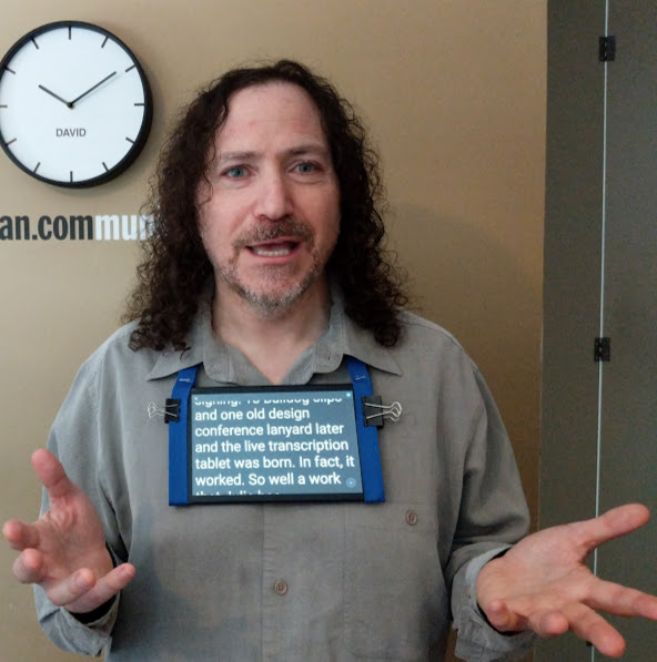
David, wearing a tablet during a meeting, so that non-hearing staff can read his words in real time.

But how to do so while keeping hands free for typing or signing? Two bulldog clips, a Lenovo Android tablet, and one old design conference lanyard later, and the DIY Live Transcription tablet was born.

It worked so well at work that Julie has incorporated the tablet use into her daily life. Here’s Julie on her experience:

“I was completely amazed there was finally an app that may work without jumping through hoops of registrations and fees!

That very weekend I demonstrated Live Transcribe to my Deaf friends and they were just as amazed as I was and thinking “Is this for real? Is this even possible?” We were eager to see if we could use it to help understand English speakers… we decided to test the app at a fast food pizza restaurant. Once at the restaurant we were all a little nervous about trying the technology out without offending anyone, but being brave I went ahead and communicated to my server that we had a tool that would help us communicate and she was curious. I signaled to the server to talk directly to me while I held my Android smartphone running the app near her so it would listen to her voice for us all to see. Their speech magically appeared in text on my phone. Everyone who was watching … my Deaf friends, the server, other patrons … were all amazed and fascinated with Live Transcribe!

Our pizza order went smoothly and we were all very satisfied with Live Transcribe: giving the app four stars on Google Play and a big thank you to Gallaudet along with Google who helped develop Live Transcribe!

Back at work, we have been using Live Transcribe, even during our live video internal meetings on Skype video. David wears an 8” tablet strapped around his neck so the tablet rests directly below his chin. Even though Skype has a subtitle option, and David has some basic ASL, I still read the superior text that appears on David’s tablet on Skype video.

At my work desk, I have my smartphone ready with Live Transcribe on always … for whenever office voice chatter starts up in the background. It’s great to be in more conversations at work!”

And now, our recipe for making your very own live transcription tablet at home…


Make your own live transcription tablet


Ingredients:

  • Any Android tablet or phone (version 5.0 or later) (Sorry, it’s not yet available for iOS.)
  • A lanyard (preferably one you got at a conference a year ago and just found in a drawer)
  • Two bulldog clips

Steps:

  1. Coax an old Android tablet or smartphone that runs Android 5.0 or higher (you may need Android 7.0 or higher, depending upon the brand) out of retirement.
  2. Download the free beta version of the Google’s Live Transcribe app for the Play Store.
  3. Attach bulldog clips on opposite shorter sides of your device, one on each end, closer to the top than the middle.
  4. Launch the app, set the type size to the second largest size, choose your language, wear, and enjoy!

Did you try it? We’d love to see it! Take a picture of you with your live transcription device (caption the picture using transcription if you like!) and tweet @davidberman … or tag @davidbermancom on Instagram and we’ll repost you!

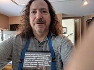
Here’s one of our outtakes: it can take a few tries to get it right…

David taking a selfie with the Live Transcription app on a tablet

For more accessibility recipes, visit our Accessibility Recipes page.

Return to top

Reviewed April 18, 2019

Press release: Rio 2016 Olympics and Paralympics Website Inaccessible for People Living with Disabilities

Posted on

Organizers report tickets sales are low; Ottawa firm proves their website excludes millions from buying tickets and offers to donate help to fix

View this press release in Google Docs

Hundreds of millions of people living with disabilities planning to follow or buy tickets to the 2016 Olympic and Paralympic Games in Rio de Janeiro this summer will not be able to do so. The official website, including the ticketing site, (www.rio2016.com) is inaccessible, according to standard international tests for site accessibility performed this month by David Berman Communications in Ottawa.

“The website fails to comply with the lowest level of international standards for accessible websites (W3C’s WCAG 2.0 Level A). This means, for example, that a person who cannot see or a person who cannot use a computer mouse who is trying to buy a ticket to an Olympic event has no chance of success. And yet Rio 2016 claims their site is accessible: we work with so many organizations who work so hard to have the right to proudly make such declarations, that we feel we need to speak up on this one and help them correct it.” says David Berman, eAccessibility and inclusive design expert.

Both the promotional and e-commerce pages of the site fail WCAG 2.0 Level A formal testing as well as informal user testing. Basic accessibility constructs, such as providing meaningful descriptions of photographs, have been ignored… meanwhile, it is impossible to purchase a ticket without using a mouse: whether using assistive technologies or not. For example, someone who cannot see (or cannot read) can use an assistive technology called a screen reader that reads a web page out loud. But key information that gets read out loud on the ticket-buying pages is unintelligible.

Canada is a world leader in online accessibility. Canada’s federal government was the first national government in the world to embrace the WCAG standards, forbidding any public-facing government webpage from not meeting or exceeding the standard. Ontario was the first government in the world to make website accessibility the law not just for government, but for businesses and non-government organizations as well. And now Canada’s new federal government has committed to the passage of a national accessibility act.

“We applied standard tests we use to test websites for accessibility to the rio2016.com site: formal compliance testing (which tests how compliant the website is against industry standards) as well as usability testing where people living with disabilities try to perform specific tasks on the site … the site failed on both mobile and desktop.” said David Berman.

This would mean that the Canadian Minister of Sport and Persons With Disabilities, Hon. Carla Qualtrough, a person living with disabilities who has volunteered with the International Paralympic Committee and previously served as President of the Canadian Paralympic Committee, would not be able to buy tickets to the Rio Olympics or Paralympics unassisted.

The same applies for many Paralympic athletes, as well as millions of people in the world who live with disabilities, points out Dean Mellway, three-time Canadian Paralympic medal winner, who directs Carleton University’s READ initiative, where David chairs the Carleton Access Network.

Brazil’s Minister of Sport, Ricardo Leyser, recently expressed concern that tickets to the 2016 Olympic Games aren’t selling.

The London 2012 Olympic website, in contrast, is often celebrated as an example of excellent accessible design.

Design teams often fear that complying with accessibility regulations will make their site lose its drama or intrigue. However, we’ve developed a library of techniques where we promise compliance with all WCAG 2.0 Level A and Level AA criteria in a way that enhances the user experience for the entire audience,” Berman continues. “We call this “No Trade-offs” Inclusive Design: instead of compromise, we improve the design for all. When we design for the extremes, and we do it well, everyone benefits.

“There’s still time to make the website accessible before the Paralympics,” Berman assures. “We’re eager to bring some Canadian know-how: we’ll donate our services to show them how to fix their sites if that’s what it takes so everyone is welcome to enjoy the Paralympic games, in person and online.”


David Berman Communications is an inclusive design firm based in Ottawa, Ontario, Canada that specializes in testing, coaching, and fixing websites, documents, and apps, to make them work for everyone. The firm works for government and private sector clients from around the world, formally auditing online products against international standards, and then coaching the best tactics to make the products meet or exceed those standards.

David Berman has served as a senior consultant for Canada’s three largest government Web publishers, and has advised governments in Australia, Canada, India, Ireland, Mexico, Norway, Oman, and the USA, as well as the private sector (IBM, banks, automotive, consumer electronics…), higher education (chair of Carleton University’s Carleton Access Network), and municipalities. David has also been appointed a high-level advisor to the United Nations on how accessible Web design can help the Developing World, was named the International Universal Design Champion for the Government of Ireland, is a member of the ISO standards committee for accessible PDF, and named an Invited Expert to the W3C (the publisher of WCAG). His passion for sharing knowledge on how the Web can help improve the world has brought him to over 60 countries, and his book Do Good Design (Pearson) has been published in 7 languages. “This is the first decade that will see the majority of humanity online. We are the first generation that has the power to include everyone…and because we can we must.”

The World Wide Web Consortium (W3C) is an international community where Member organizations, a full-time staff, and the public work together to develop Web standards. Led by Web inventor Tim Berners-Lee and CEO Jeffrey Jaffe, W3C’s mission is to lead the Web to its full potential.

The Web Content Accessibility Guidelines (WCAG) 2.0 covers a wide range of recommendations for making Web content more accessible. Following these guidelines will make content accessible to a wider range of people with disabilities, including blindness and low vision, deafness and hearing loss, learning disabilities, cognitive limitations, limited movement, speech disabilities, photosensitivity and combinations of these. To reach Level A compliance, a product must comply with 25 Level A success criteria. To reach Level AA compliance, a product must comply with the Level A success criteria as well as the 13 Level AA success criteria.

More information about WCAG 2.0: https://www.w3.org/TR/WCAG20/

More information about W3C: https://www.w3.org/Consortium/

The web accessibility audit process: https://davidberman.com/accessibility/accessibility-audit-services/

David introduces you to Web accessibility: https://www.youtube.com/watch?v=VIRx3RJzbZg&index=1&list=PL6J3hNm0YtpMJr4fGNHyU5vIPd8cZWcEx

More information about David Berman: www.davidberman.com/about

More information about David Berman Communications: https://davidberman.com/accessibility

Press photos of David Berman: https://davidberman.com/courses/for-speakers-bureaus/#photos

Wikipedia article on David Berman: http://en.wikipedia.org/wiki/David_Berman_(graphic_designer)

Contact Information

David Berman, email: berman@davidberman.com @davidberman, phone: +1-613-728-6777

Tamara Torok, media liaison, email: tamara@davidberman.com, phone: +1-613-728-6777

Dean Mellway, email: dean_mellway@carleton.ca, phone: 613-520-2600 x1144
-30-

Return to top

Reviewed August 9, 2016

Transcript of David Berman keynotes at 2015 Plain conference: e-Accessibility: Leaving no one behind online
Posted on

This is a transcript of the video David Berman keynotes at 2015 Plain conference: e-Accessibility: Leaving no one behind online.

[MUSIC PLAYING] [DAVID SPEAKING VERY POOR IRISH GAELIC]

…so I think it’s best that I address you today… my words will be more accessible today… if I speak in English. I’m wearing a pair of goggles. And they’re the goggles we use… when we’re testing websites for accessibility because we tend to think about accessibility with people extreme deficits. Someone who can’t see at all and has never seen. Someone who is quadriplegic, has very little mobility.

And yet the vast majority of disabilities are more subtle. And so we have these goggles, for instance. They’re designed by a doctor I met from Pennsylvania. And on this set, on my left eye, this limits my vision to about eight degrees. On the

right eye, this is a Coke bottle- “Trailer Park Boys–” if you know Canada, “Trailer Park Boys–” -kind of a lens.

And we have a whole set of these. In fact, my cat, Spice, who travels with me: she’s wearing a simulation of cataracts. Actually, you may want to try one of these on, got a whole bunch of them. You could try one of them on for color blindness or macular degeneration…

Actually, you can pass these around here. Have some fun with these. And in fact, our cat can even travel. Row. You know, the thing is that my focus has been on accessibility for some time. And yet I started out as a graphic designer.

How many of us are writers here? Show of hands. Designers, information designers? Managers? OK, thank you.

This is a picture of me from 1985 when I just first started out being a graphic designer. And when I first started out being a graphic designer, it was all about typography for me. I was crazy for type. I still am.

But to me, it was this wonderful universe. I could take all of these column rules and words and justification and I could create this perfect little universes. I didn’t care that much about what I was saying. It just had to do with what it looked like.

And then in the ’80s, in 1985, a woman who was an activist in plain language wandered into my studio with a project. And she forced me to deal with the reality that no matter how pretty the words were, no matter how well organized they were, if we weren’t saying something useful and we weren’t saying that communicated clearly, there was no point in doing it at all.

And in fact, it helped shape my career. Because I ended up doing some really exciting work. For instance, my biggest client for about a decade was Health Canada, Department of Health. And in Ottawa, Canada, where I’m from, we’re the ones who invented this idea of putting messages on cigarette packages. First just words, then pictures.

Extremely plain language which has saved lives worldwide. And now everywhere I travel– been to now over 60 countries– and everywhere I travel, I see this Canadian idea. And I remember it went from completely ridiculous, there’s no way you’ll ever get that approved to traveling around the world and seeing everywhere we go this type of thing.

Another crazy tilting of windmills thing was we did a special project for the prime minister’s office in Canada where the idea was what would happen if we rewrote the law in plain language. We took the Employment Insurance Act. And not just to redesign the words, but to do plain design as well.

And to think about digital accessibility. And we did this work. And we did studies. And we weren’t surprised to find that the common person was delighted when they compared the old and the new version. The idea that they didn’t need a lawyer to understand a law of their own country. Cornerstone democracy.

What really amazed us was that we did testing as well with lawyers, and the lawyers also preferred the plain language version and the plain language design.

That very activist I mentioned, actually, we ended up working on a project for almost two decades. A project where we were helping family farmers create sustainable farms in Ontario.

And one of the cornerstones was– it was a massive plain language project. I had never been so immersed in it. And this project, now in its fourth edition, it became a CD-ROM. It became a website. And now in its most recent incarnation, we’ll now make it e-accessible as well.

So the first layer was to use language that was meaningful to everyone. The second layer is now it’s in a programming format as part of an online portal where everyone can access it because it fulfills standards for international accessibility for websites. And now, over 80% of the family farmers in family farms in Ontario have attended our course, which is about four times as many as anyone would ever imagine.

Now, just last month, I spoke at accessibility conference in Toronto. And I met this remarkable guy. Kerr Watson is a young man. He’s about 25. Though at first glance, you think he’s more like 14.

He has extreme challenges in terms of communications. And if you just met Kerr and you tried to interact with him, you’d probably think that he’s a person that is simply not responsive at all until you read what appears on the tray on his scooter. And I’ll read this to you because it’s one of the most brilliant pieces of plain language I think I’ve ever read.

And it’s a case where plain language opens up someone’s life. It says, “Hi, I’m Kerr, pronounced ‘care’. Please talk to me directly rather than to my assistant. I can hear. I like it when people talk to me in a quiet voice.

I’m an adult. I understand everything you say. Please ask me yes/no questions. I blink for yes. If I don’t blink, ask if I meant to say no. I’ll blink to confirm.

My visual impairment makes it hard for me to look at you. If you think I’m not listening, I may be having an absence seizure. My assistant can help if we have difficulty along the way.”

These few sentences are the difference between Kerr interacting with the world and being ignored. Indeed, from Ontario and from Canada, I’m proud to say I bring you messages of leadership in accessibility. And it’s because we’ve been leaders in legislation.

I’m proud to say that I design and I write and I edit in a province where it’s actually against the law to not try to write things plainly. That’s amazing. And we want to share that globally.

I was brought in by the Worldwide Web Foundation to be part of a study they do every couple years called the Web Index. And what we did is we study countries around the world to see how they’re doing in terms of making a web presence that’s truly meaningful.

And embedded in that were four questions about accessibility. So we are able to benchmark legislation and government and private sector websites from all these different countries to see how well we did. And it’s no surprise to me that the countries in this room are the countries that do the best. That the countries that are best represented in the plain language community are those countries where we’re finding the best online web presences.

Now, if you do a Google Trends search of the phrase “web accessibility” these are the cities that come up. Ottawa, where I’m from, is ground zero. 100 points. And Toronto, the capital of Ontario, is also on that list. And the reason for that is Ottawa is our national capital and we were the first country in the world to legislate that it was against the law for any public facing government page to not comply with an international standard of accessibility.

Now, these international standards are a mixture of editorial, design, programming issues. And I’ll tell you a little bit more about that for those who aren’t familiar with it. But then Toronto, capital of Ontario. Ontario was the first jurisdiction on the planet to say not just government but private sector and NGOs as well had to publish at a minimum level of accessibility, or else it’s against the law.

Now, we tend to think of design as decoration. And yet to me, design is life and death. Consider this. This is a picture of a traffic signal in Dublin. But I could’ve taken it pretty well anywhere in the world. It’s a classic. The red and green system of is it safe to come and go.

And I’m going to just press my magic button and remove all the color. Now you’re seeing what traffic signals look like to someone with a complete color deficit. You know, 10 and 1/2 percent of the male population of Ireland has some level of color deficit. And you know what the largest source of accidental death is in this country?

That was a question.

[LAUGHTER]

Road traffic.

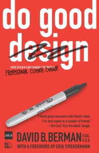
Road traffic accidents. Who said that? Thank you. You know, we got to encourage participation. Here. Here’s a copy of my book, Do Good Design.

Road accidents. And the majority of the deaths are at intersections. So at these intersections, how can we rely on a system that doesn’t use just color? Well, we can.

This is what we’re doing in Quebec: the next province over from Ontario invented a better traffic signal. So here, in these traffic signals, we’re still using the classic green to go, red to stop, so the legacy users understand it. But as well, we’re not relying entirely on color.

The number of lamps. There’s two lamps when you’re stopping and only one for go. And the shape as well. Square for stop, round for go. Diamond for maybe.

And in this way, we’re still using color but we’re not relying entirely on color. And we translate the same type of thinking into document design. We get the same idea that if we make sure we don’t write instructions that rely on color, we’re making sure that everyone’s included.

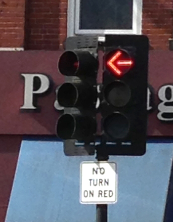
Now, this is a traffic signal I saw in Boston, Robert. This is downtown Cambridge. And now what is this symbol supposed to– can someone in the audience who can see color tell me, what is this symbol supposed to mean?

“Don’t go left.”

Don’t turn left, right? What does it say to someone with a complete color deficit?

[INTERPOSING VOICES]

“Kill yourself now” is what it says. Have you driven in Boston? I mean, so you’re basically saying one way to get rid the problem is to kill off the colorblind folk. The colorblind folk…

Yes, I’m a colorblind graphic designer. I was embarrassed to say it for the first 10 years. And I just wear black and I get away with it.

But as a designer interested in accessibility and inclusion, what became really clear to me early on was that happening to live right now, happening to live in this age where it’s never been more possible to share ideas, I think the online is the biggest opportunity to help do good. Because you know, Hannah and I went over to the Treasury at Trinity College.

And there’s this enormous, wonderful collection of ideas, of words, of books. And in the century since the liberation of these ideas, I don’t think anyone even imagined that we could overcome the politics that wouldn’t allow everyone to have access. But did we imagine that we could overcome the idea that someone whose hurdle is that they can’t see would be able to read all these books?

Or someone who lives 10,000 kilometers away could read all these books? Now, in the last 100 years. Well, you know, in the last 30 years more people have been liberated by information technology than all the wars and revolutions in the history of humankind. We get to live in a remarkable time.

And in those last 100 years, the divide between those who had access and those who don’t has basically broken down to four screens. The first screen, a movie screen. Like right now, we’re sharing in a theater arrangement.

The second screen was the television. And no technology took over the planet faster than the TV. And indeed, people love this. And they had some level of control over interaction because they could choose different channels.

The third screen, though, was the computer screen. A chance for true interaction. And yet it’s this fourth screen, the mobile screen, that will actually be the first place that most of us meet this amazing ability to access documents. We tend to think of the Internet as ubiquitous, and yet only 31% of humanity has internet access.

But this is the decade where that changes. By the end of this decade, a majority of humanity will be online. And if you think of all the amazing things we’ve developed just in the last 10 years online, the YouTubes and the Twitters. And yes, it’s smart to have entire documents that are only 128 characters long.

All these innovations. Imagine if 31% of us are innovating, what becomes possible when all of humanity is online. The mobile devices have also made remarkable things possible. I want you to imagine for a moment. In fact, imagine someone you know.

Maybe you have a child. Imagine that child is a year and a half old. Or maybe a nephew or a niece. And she wakes up in the middle of the night. It’s two in the morning and she’s crying. She’s screaming and she can’t tell you what’s wrong because she doesn’t have the words.

But something’s clearly wrong. And here in Ireland or in Canada or Australia, you’d pick up the line and you’d call the 24/7 nursing hot line. You’d say, ah, I don’t know what to do. My daughter is really not well. And I don’t know what to do. What do we do?

And they say, oh, symptoms. Oh, go to the 24/7 Boots. Go to the pharmacy. Get this drug. Come back, give it to her, and she’ll be OK. And you do that and everything’s OK.

Except if you lived in Ghana, it’s not so easy. Because in Ghana, 25% of the pharmaceuticals are fake, which means that you make the call, you rush to the pharmacy, you get the drug. You don’t know if it’s going to help your daughter or whether it’s going to kill her.

And even aside from the medical risk, there’s an indignity there as well as a hit on the economy. So what did they do? This group called mPedigree came up with this remarkable invention. The reason I came across it is we were judging a global design awards program throughout the developing world. And there were all sorts of amazing graphics and color and stuff.

But of all the entries from 111 countries, this is the entry I love the most. This group called mPedigree invented a system where when you get the pharmaceutical, there’s a sticker on the drugs. And you just take your nail and you scratch it off, and there’s a unique number on the pill.

You then take your mobile– which if you’re in Ghana costs one penny per text– and you text that number to this SMS number. And immediately comes back a Yes or a No. A plain language message that tells you whether that’s safe drugs for your child.

That’s 128 characters. No color, no special fonts. That’s 128 characters of pure plain language love, great design, better security, better humanity, better civilization. And it’s pure innovation. And that’s where I see our opportunity.

So when it comes to e-accessibility, of course we think of the idea that we all want to take care of everyone. It’s the right thing to do. But in fact, we need to find reasons to motivate our clients to want to make everything accessible. And I find there’s five reasons.

And the first reason is there’s just so many of us. And we want to include everyone. And what percentage of people do you figure live with a substantial disability? What do you think? What are the numbers?

I’m sorry, 20% perhaps? 15%? You know, I’m skeptical. These are the numbers the government tells us in Canada, too. I’m skeptical because just yesterday Claire reminded us that one in six adults here in Ireland live with a level of literacy where they can’t use the websites.

So if one in six adults in Ireland have a literacy challenge, I think the number is higher. Actually, I’d like you to do a little experiment, if you’re willing. Maybe. I said we’d give awards for participation and you gave me the 20%, so thank you.

Actually, Hannah. Easily recognizable with her interesting hat. If you give Hannah your name and email address, we’ll do an informal accessibility audit of your website, if you’d like. Is that interesting?

Lovely. That would be great, thank you.

If you’d like that, just give Hannah your credentials. So I want try an experiment, if you’re willing. And I don’t want to embarrass anyone. But I bet you just in this room, we have way more than 15% or 20% or 18% of people with disabilities. Are you willing to try this?

I’ll tell you what we’re going to do, and then you can decide. Here’s my plan. I’m going to list off a whole bunch of disabilities. And only after I’ve listed them all, I’ll ask you to stand up. Or if you’re in a wheelchair, don’t stand up.

I’ll ask you to stand up and we’ll see how many. And by the way, I have two and a half of the things I’m going to list. So I’m going to list them all. Don’t stand up until then. And then I’ll say, “OK, everyone stand up if you have at least one of these things.” All right?

You’ll figure out what I’ve got by the end of the 49 minutes. So here’s my list. Can you not see at all? Do you wear glasses? Do you have a color deficit? Do you have trouble reading the lettering on the bottom left corner of the screen here?

Do you have a hearing challenge? Do not hear certain frequencies of sound? Do you have trouble hearing in certain situations? Do you have a mobility challenge? Do have carpal tunnel syndrome?

Have you ever had you arm or leg in a cast for more than two days? Have you had laser eye surgery? Are you pregnant? Are you drunk? Are you stoned? Did you not get too much sleep last night because that Temple Bar region, they make noise all night long?

Do you live most of your day in a wheelchair? Do you have an attention deficit challenge? Are you already bored with my list? Autism?

Was English not the first language you learned? That’s a lot of things, and there’s more things. But hey, look. OK, stand up if you have at least one of these things. Let’s see what we’re dealing with here.

Oh my goodness. That’s a lot of people.

OK, my friends. I want you to look left. I want you to look right. And I want you to realize that when we’re writing, we’re writing for everyone. We’re not writing for some shut ins with a miserable little life somewhere, this mythical thing we think of someone with a disability.

These are the well dressed, awesome, humorous, cool people you are writing for, designing for. Do you get it? Thank you so much for exposing yourselves. You can sit down now.

The second reason why we need to make everything accessible is for search engines. The Google search engine or the Yahoo search engine or the Bing search engine has the cognitive ability of perhaps a four year old. And when we organize our information in a way that assistive technologies can interpret it, it also means that Google can be confident that it recognizes what it’s perceiving and can structure it properly… which means more accurate hits on Google and also more search results. Because Google only wants to share information if Google is confident.

The third is if we want to retain and attract the best people to our organizations, well, we want everyone involved. Who would want to not be able to have Stephen Hawking working in your organization. Because we want people involved in the process of creating documents every step of the way and not just being able to perceive them.

The fourth reason is the love. It’s the right thing to do. We sleep better at night knowing we’re part of the design of a better civilization.

But the fifth reason that really compels me to be with you today is legislative. And I’m showing pamphlets here from the Ontario government that they’ve handed out because now the businesses across Ontario need to understand how to provide online and in-person accessibility. There’s a lot of education that needs to go on.

The good news is this. Whether you know a whole lot about e-accessibility or hardly a little, this is the perfect time to learn. It’s never been easier. We used to run two day courses on this, and now we do them in a day because the tools have gotten better.

The understanding’s become better. The software is better. The hardware is better. The assistive technologies have also become more available. Now, in order to design really well for disability, though, we need to understand what we’re grappling with.

And so I’ve very briefly organized the types of disabilities based on the human senses. The key, though, also is when you think about disability, most of them are not permanent. A permanent disability, someone, let’s say, hasn’t seen since birth and may never see. That’s an extreme case.

But the vast majority of us have more subtle things. Maybe we could have full mobility, but it hurts when I move this arm. I just don’t want to do it that much. Maybe my hand shakes a little.

So we have episodic disabilities as well. Perhaps I just happen to be on the bus holding groceries in one arm and trying to dial my phone in the other. That’s a temporary. Or at the gym. You know, when you’re on the treadmills. And there’s five different screens up, they’ve got different channels.

And so they turn off all the volume because otherwise it would be this cacophony. Well, they put the captions on. So now we’re all using the captions even though we may be able to hear just fine.

We have a temporary ability not to be able to hear. And so we all enjoy those captions. Or when we’re watching Downton Abbey in Canada: we really enjoy the captions.

And we also have acquired disabilities because as we age– in 15th century Ireland, the life expectancy was perhaps 36. And we all want to live past 36. But you know, we’re working with this 50,000-year-old hardware and it does start to break down at a certain point.

So we have aging-related challenges. And then if it’s not bad enough, we also have society judging us. Like being left-handed in some parts of the world is still something they try to force out of kids at an early age. And that messes with their heads, for sure.

So the impairments: I’m listing them in the order here that affect us most online. We have visual challenges. We have dexterity or mobility challenges. And we have hearing challenges. And all these challenges, they can be the most extreme or they can be the most subtle, and we want to take care of all of them.

Language and speech difficulties. Cognitive challenges. We do work at Carleton University, and 80% of the students who come to the accommodation desk at Carleton University are actually dealing with cognitive challenges. Though you’d think it’s all about people in wheelchairs and stuff.

And then we have all these wonderful things we’ve invented to overcome these challenges. We call these assistive technologies. And by understanding them, we know how to best write or design or code for making sure they all work. And I’m just going to show you a few of them.

For instance, we have a lot of tools for taking an image and zooming. And we all enjoy this on a small screen device. You know, they told us 20 years ago our screens were going to get bigger, but they got really smaller. All this pinch and zooming we do.

In fact, you go to those new sites where you do “Oh, I got to zoom in” to see the line. But then I got to go this. And I got to go down and around. And then I got to zoom in.

Those are the websites that aren’t following the standards of how to create an accessible site. But those sites that are delightfully just always the right size and you turn your phone and it just works and everything, those are the sites that are following the rules on how to create accessible experiences.

This is a technology that was developed also in Ottawa. It’s a technology that follows where your nose is and therefore knows where you’re looking. And then when you blink, it knows when to launch the missile– It knows when to launch the whatever. We know where the money came from.

But the amazing thing is that although developed for one reason, everyone prefers this. In fact, Lenovo is planning on building Nouse– it’s called a Nouse because it’s like your nose and a mouse– your Nouse. Building all these Lenovo laptops are going to have Nouse-like technology in the next 24 months.

And then everyone’s going to be wandering around. Bad enough people are wandering around talking to themselves. They’re going to be wandering around blinking at their tablets.

This is another technology made in Ontario. This girl is wearing a pair of goggles. Her name is Yvonne. I actually met her at that same conference. And the goggles take the information, and this computer she wears on her waist. And these two LED displays.

And it actually redesigns what she’s seeing in real time. I tried it out. It was amazing. Now, she’s got a visual challenge where she can’t see anything in the middle. She only sees stuff in the periphery.

So what this does is it’s constantly, as she’s looking around, it rebuilds the middle of the vision. She doesn’t just wear them walking around. Yvonne wears them all the time. So when she’s at her computer looking at your website, she’s also wearing these goggles.

And I asked Yvonne what’s it like to wear the goggles all the time. And she says “Since she got the goggles, I can be the person I’m supposed to be.” She doesn’t see this as a different version of herself. She sees the goggled version of Yvonne as the true Yvonne.

Here’s another technology which is really cool. This girl’s wearing what we call a sip-puff device. And if you’re a quadriplegic, the idea is you can’t use your limbs below your neck. But she can, by moving her head around, that’s like moving the mouse. And by sipping and puffing on the tube, that’s like left-clicking or right-clicking a mouse.

(If she’s using a Mac, she has to stop for breath, I guess.) And the thing is that if you design your website according to these standards, she can use it. If you don’t, she can’t. It’s that simple.

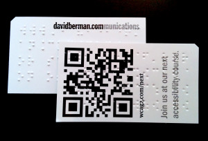
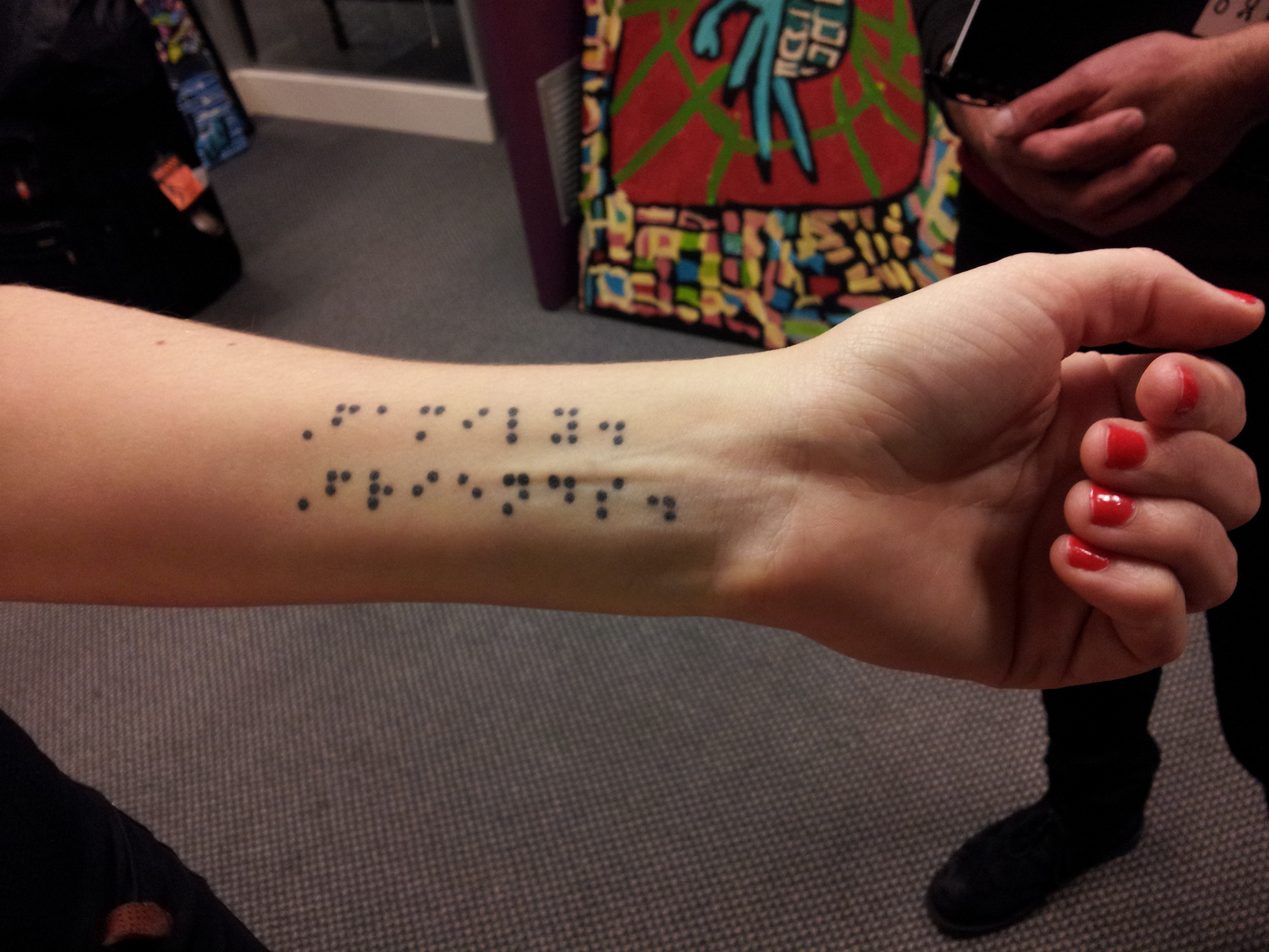
You don’t have to know about how all these technologies work. But if you follow the international standards, if you follow the style guide, they may say, then everything falls into place. You know, we are all familiar with Braille. And I handed out a number of our Braille cards. Many of you have these in your hands.

But you may not realize that the same Braille is used digitally with devices like screen readers or dynamic Braille display. What it does is all the Braille dots pop up. So you press Enter. You hear the next. You’re listening, but you’re also feeling the lines.

And when you see someone who can’t see using a Braille display or something printed from a Braille document. Again, if you follow these accessibility guidelines, then your websites will magically… Press “Print.” They’ll print perfectly on the Braille printer. If you don’t follow the guidelines, who knows what you’re going to get when you click “Print” on the printer.

Another thing that’s really breaking through for us and making this all much more relevant is that the cost of these assistive technologies is dropping phenomenally. And an awful lot of the technologies that used to cost a lot– like let’s say I had a device that told me what color my pants are. It may be a $150 device that I just carry with me.

But now, it’s a $4 app in my phone. And so many other things based on tablets and these other technologies that are mainstream technologies like Siri can be used to help people do things. Like when you’re driving, you have a temporary mobility deficit with your hands. And you have attention deficit because of your eyes. And you have a visual deficit.

But you could use a technology that lets you glance over at a tablet and look at a map, and it can interpret what you want. You’re just taking advantage of all of these assistive technologies. Ultimately, what we’re trying to get to is an idealized world where everything is accessible to everyone on any device at any time, any bandwidth. And we will never, ever achieve this.

And the reason I’m telling you this is because I don’t expect you to be able to do it to perfection. What I want you to do is just exceed a minimum standard. And that’s why style guides are so awesome, by the way, Dave, I also think. It’s because you’re saying to people, here’s the bar. Here’s what’s good enough.

Because I don’t want you to be daunted by this. Oh no! What if I try to make my document accessible and my website accessible and then some expert comes along and says, “That’s not accessible enough”. We have a minimum standard. And of course we’d like you to exceed it.

But if you know you can exceed the minimum standard, then you’re part of the solution rather than part of the problem. And that’s where this awesome thing comes along called WCAG 2.0. WCAG is the Web Content– content, that’s us– Accessibility Guidelines. They’re published by a volunteer group based in Boston, but work all over the world.

Some of us are in Canada and some of us are in Europe and some of us are all around. And this idea of WCAG 2.0 allows us to set a standard where it basically sets a bunch of rules that if you do all the Level A rules, you can say my product is a Level A compliant document or site.

If you follow all the AA rules as well, you’ve got a Level AA product. So for instance, there’s 25 Level A rules and 13 Level double A rules. So that’s 38 rules you’d have to follow.

Now, that may sound a little daunting. But some of them apply to writers. Some of them, your programmers will take care of for you. So look at this.

These are the WCAG rules, just a sample. And they have to do with plain language. So we’ve got a standard that already includes the stuff that we’re all about. And we’ve got legislatures passing laws saying you’ve got to do this stuff.

So for instance, the sensory characteristics rule– and it’s something that’s important for writers to be aware of– says it’s OK to give instructions about color as long as you don’t rely solely on color. So that thing I showed you with the traffic signals and the physical world has an analogy in an e-document that says, yeah, it’s OK to say that you can find Hannah because she’s wearing the orange hat.

But I’m also going to say it looks like little bear ears because if you can’t perceive orange, you can still find Hannah. And all of these rules are most of the stuff we already know and love. So we don’t have to say to the client, oh, you really ought to.

You can say, “I agree. But hey, it’s the law here in Ontario. You’re going to have to spell out that abbreviation on first mention, so I think we’d better do it, don’t you?” So it’s like, argument’s over. So I’m looking for you to work with me to make this more the reality in more parts of the world.

Because some places have guidelines and some have rules. And in fact, we created this tool, which you’re welcome to download. It’s free. It’s called the Berman Accessibility Ribbon for Word. Because we realized most accessibility, if we want to build accessibility in from the get go, we have to make it easier for people.

So this is a ribbon that goes into Microsoft Word. And what we did is we made it so that all of the features in Word which make documents accessible are in one ribbon. As well, we have the word “Accessibility’ up in the left corner of the Accessibility Ribbon. So it’s reminding you about accessibility. But I didn’t say that.

So you download this. Install it in Word through your whole organization. We’ve had dozens of organizations do this. And now it makes it easier to build accessibility into documents right away. And all around the world, look at this. You just have to learn this one WCAG 2.0 thing.

Every country in the world I can find that’s passed legislation is pointing to WCAG 2.0. So you only have to learn this one tool and you’ve got clients all around the world eager to work with you to make it make sense. Now right here in Ireland– I’m sorry, in Ontario I told you about how we’ve got this legislation already going.

The legislation was passed in 2005. But deadlines for having to comply have already kicked in. So any organization in Ontario with over 50 employees already has to have a public-facing website that complies with these standards. Or they can be fined.

It’s like not having a wheelchair ramp running into your building. It’s like not having a wheelchair ramp running into your website. Norway then leapfrogged Ontario in terms of saying Level AA for private sector. And Ireland, actually, back in 2005 passed a Disability Act which implies the idea that at least the government here has to publish in a way… And the guidelines published by NDA…

You know, I was so amazed. I’ve never seen a country before that has a universal design department. That is an amazing achievement. And I’m eager to go to other places and say, you’ve got to be like Ireland. You’ve got to have yourself a national disability authority, a universal design department as part of your government.

And so the principles in this act suggest WCAG 2.0 compliance. Look, just like Dave, Mr. Marsh– Dave or David?

David.

Thank you. I hate it when people call me Dave. And I just did it to you. I’m really sorry. David. David. We’re on the same page.

We need standards so we can exceed the standards. Singing from the same hymn book. And by being able to go there, it means that we can create a better civilization. And you know, I’m passionate about this stuff obviously. And there’s the book.

I wrote a book about this. And for the last six years, it’s been going from language to language around the planet. And obviously, I’m passionate about the whole topic of e-accessibility. But I just want to share one last thing with you before I stop, which is that I , you know, I started off by saying that this activist wandered into my office 30 years ago.

And it’s that type of activism in Ontario that created the legislation that now has made it the law that plain language is the law. But you know that person, that activist, is Ruth Baldwin. And Ruth, you’re here, right? Ruth Baldwin. And so I know we thanked Ruth last night as a group.

[APPLAUSE]

But I can’t tell you how much pride it gives me to be able to thank her in person with all of you present for helping shape my career. And helping light a match under me, which has allowed me to spread a lot of good. And I’m hoping that together as advocates– obviously you’re all advocates for doing good.

And as you go back to your countries, I want to show you that it is absolutely possible that we can have laws on this planet that say that plain language isn’t just a good idea. It should be the rule. And being able for everyone to be included isn’t just a nice idea. It’s a human rights issue.

And together, we’re making that happen. And let’s continue to make it happen. And thank you for your time.

[APPLAUSE]

AUDIENCE MEMBER 1> Just from personal experience I’ve had a couple of years ago to get certain documents into some standard compliant that credit enormous files which would’ve meant that a lot of people actually could not access them because they didn’t have the equipment to handle those sorts of files.

So I’m just wondering how you cope with the

practicalities of– obviously modern technology can cope with all the new standards. But this practicality of bringing everything up to–

DAVID> The challenge of legacy documents. It happens all the time. You know, we work with like the Canadian government. Imagine we had tens of thousands? We had an awful lot. We had piles of documents that have been published over many decades.

And one of the refreshing approaches, for instance, Ontario took, was that they said anything published before this date is going to be optional. And instead to focus on the going-forward. Because you will only have limited resources. So it makes sense.

We teach people techniques on how to build accessibility from the very get go. And although there are techniques where we can take any old document, any ancient document, and turn it into an accessible document, it can often be a lot of work. And so we recommend, let’s focus on the future and then come back to the legacy documents later on.

MODERATOR> Oh, put your hand up again, sorry, just for my colleague who’s coming down there. Oh, she has you. Thanks.

AUDIENCE MEMBER 2> I just wanted to ask about accessibility around the world. And has it been difficult in talking to people and getting governments and organizations involved. And same token, has it been getting easier, too.

DAVID> It’s absolutely getting easier. Part of that is the human rights, the United Nations getting– by the end of this decade, perhaps every country in the UN will have signed the declaration on the rights of people living with disabilities. And that means nations have to do certain things at home to get it done.

It’s like recycling. If 10 years ago I were to say to you every room in this castle is going to have a recycling bin in the corner, you probably would have said “Oh, David, that’s a sweet idea, but you’re a crazy long-haired tree-hugging hippie.

And yet now we consider it de rigueur to have recycling everywhere. I think this is the decade of inclusion. Though right now maybe it sounds fanciful that governments would pass these laws, I believe 10 years from now we’ll be gathering– five gatherings from now.

And we’ll be saying oh, yeah. That’s right. There was a time when this stuff wasn’t the law. But country after country is adopting this. Whether it’s for all the benefits or the legal risk, which is that as expectations rise, there are more and more lawsuits from people saying, hey, I have a right to access that.

And if you want me to put my bins– bins? My garbage out. My bins out on the curb on the right day of the week and info’s only available online, you have to give me a website that is accessible if you expect me to conform with the law and not pay the 150 Euro fine for not putting my garbage out on the right day. And so that’s where it’s coming from.

MODERATOR> Great. One more, quickly. Yes, thank you.

AUDIENCE MEMBER #3> Hi, David. [INAUDIBLE] from Australia. I was just wondering what the technical accomplishments are. We have a problem where people aren’t skilled enough in the back-end work to meet the requirements. We can edit the content, but we’re aware we need further technical support.

When we’re looking for people to help us on our projects, what do we need to look for from designers who are skilled in this area?

DAVID> Well, it’s a good question. Because of course it’s going to take time for everyone in the industry to know their part. So for instance, in Ontario where we’ve certified the profession of design, we now updated the curriculum in the universities and colleges so you can’t pass your graphic designer certification examination unless you understand color contrast, font choices, et cetera.

But that’s relatively new. In the design world, we’re passing standards globally to get this done. In the editorial world, we need to do that as well. In the web development world, we need to that as well. It’s going to take time.

So part of it is pulled by the business benefits of doing this. But we’ve found in Ontario it was the legislative minimums that really pushed it out that now the training’s available. In Australia, you have a fantastic infrastructure of education in e-accessibility, some of the best in the world.

AUDIENCE MEMBER #3> Yeah. It hasn’t quite reached that spread yet. And a lot of government agencies are coming to us saying, how do we achieve this? So there is definitely a lag there. So thanks anyway.

MODERATOR> I think one more. Towards the back there.

AUDIENCE MEMBER #4> Thanks, David. I was just wondering, would you like to give us just one or two examples, maybe of your favorite, or what you would regard as a gold standard accessible website that maybe we could all just go and take a quick look at. Just maybe one or two of your personal favorites. You mentioned the farming environmentally website at the very beginning. Thanks.

I’ll give you one that we constantly refer to. And it may seem, again, we’re flying my own flag. But the Canadian federal government website is probably the best site you’ll find because it’s deep. It’s got hundreds of thousands of pages. It’s got all the complexity of a federal government.

And right from the portal on down, you’ll find sites where we’ve demonstrated that designing accessibly doesn’t mean trade-offs. Designers are terrified that if they follow all these rules that their sites are going to suck. Writers are terrified if they follow all these rules that they’re going to lose all the nuance and the drama.

Well, you guys know that’s not true when it comes to plain language. But designers are concerned about that. And what the Canadian government website– canada.gc.ca– demonstrates is you can have a site that’s rich, intriguing, integrated, consistent, and completely accessible at AA without any trade-offs. So I’ll give you the one example.

And I’m around. If you have more questions, I’ll stick around the break and all that. I’m not going anywhere.

MODERATOR> Perfect. Thank you, David. That’s really great.

3Play Media 01/13/16, 8:21pm

Return to top

Reviewed April 14, 2016

“Solving Web Accessibility: Leaving No One Behind.” white paper by David Berman

Posted on

I want to let you know about a white paper recently published, called “Solving Web Accessibility: Leaving No One Behind.” I wrote it with 3Play Media (when we send media out for captioning, 3Play is our first choice: check them out).

Grab a copy… you may find it helpful, both in your own work and to explain what accessibility professionals like us are up to all over the planet. Just another way to achieve accessible websites and documents without tradeoffs for all.
Download the white paper now at: http://www.3playmedia.com/2015/10/22/whitepaper-solving-web-accessibility-leaving-no-one-behind/

No time for white papers? No worries: if I had to say it all while standing on one foot, it’d be: “When we design well for the extremes, everyone benefits … if we know how! You’ll broaden your audience, drive down costs, and feel good doing good!”

Here’s what 3Play says about the white paper…

Solving Web Accessibility White Paper


It’s a free white paper on web accessibility benefits and guidelines. The 16-page paper was co-authored by accessibility expert David Berman.

  • No one knows web accessibility like David Berman, an internationally recognized accessibility consultant whose clients include IBM, the International Space Station, and the Canadian Human Rights Commission.David has collaborated with 3Play in the past, presenting in webinars like 11 ½ Free Tools for Testing Website Accessibility and Demystifying WCAG 2.0: An Intro to Web, Office, InDesign, and PDF Accessibility. This time, he shares his expertise in writing, covering topics such as:
    • The benefits of making your web content accessible
    • Types of physical, sensory, and mental disabilities that affect how people access the web
    • Assistive technologies for different types of disabilities
    • What makes an accessible — or inaccessible — digital experience
    • An overview of web accessibility laws in the US and Canada
    • How to follow WCAG 2.0 universal design standards
    • Resources for checking compliance with inclusive design rules

    This white paper is intended for administrators and developers of website content, media producers, accessibility coordinators, as well as instructional designers and education technologists.

Worldwide, more than one billion people have a disability. Disability affects one in three families in North America, and if it doesn’t affect yours, it is almost a certainty that it affects someone close to you. What is important to note when looking at these statistics is that, while these numbers already make up a significant percentage of the national and global population, the proportion of people living with a disability is growing.

With miraculous medical and technological advancement comes a critical need to improve accessibility measures to accommodate the growing population of individuals with disabilities. This white paper is intended for administrators and developers of website content, media producers, accessibility coordinators, as well as instructional designers and technologists. This paper will provide you with a deeper understanding of web accessibility and will cover the following topics:

  • The benefits of making your web content accessible
  • Types of disabilities and online challenges
  • Assistive technologies for different types of disabilities
  • What is necessary in creating an accessible digital experience
  • The legal landscape of accessibility
  • Tips for improving your web accessibility
  • Conforming with WCAG 2.0, ADA, and AODA
  • Resources for accessibility compliance

Return to top

Reviewed February 8, 2016

Transcript of Shaw Media talks about David Berman Communications onsite accessibility course

Posted on

This is a transcript of the video Shaw Media talks about David Berman Communications onsite accessibility course.


(TEXT ON SCREEN: David Berman Communications Review, November 15 2016, Shaw Media)

(TEXT ON SCREEN: Andrew Davies, Experience Design Manager, Shaw Media)

(A man in a sweater faces the camera, and continues to do so throughout the video.)

My name’s Andrew Davies, and I’m the Manager of Experience Design for Shaw Media. My team of web designers and user experience designers are responsible for the maintenance and enhancements to all of our brand websites and applications. Those brands include Global TV, Global News, Food, HGTV, Slice, History, and Showcase.

My team will be embarking on a redesign of one of our major branded websites, and there was an opportunity for us to incorporate accessibility as part of this redesign. So essentially David came in for a full day of training for about 30 developers, 10 graphic designers, and my UX team. I was concerned that taking that many people out of their daily work schedule was going to be really hard on the business, and also be hard to keep those people engaged.

David used real-life examples, got people up and interacting. It was an amazing experience. Tremendous amount of feedback. People stayed for the entire session. Often times people would be jumping up for meetings in other full-day sessions. Not the case with David’s.

I’m very confident that moving forward we’re going to be able to incorporate all the best practices to make sure that our new branded websites will be fully accessible, and that we’ll achieve web accessibility accreditation.

(TEXT ON SCREEN: David Berman Communications Review, November 15 2016, Shaw Media)

[END OF TRANSCRIPT]

Return to top

Reviewed January 14, 2016

Redacting women

Posted on

I was in Oman last month, where I was invited to teach government representatives and agencies about e-accessibility. It was a remarkable week; in the evenings after teaching I was able to wander around the amazing world that is Muscat, Oman’s capital city. Oman is a truly unique country containing a mix of ancient cultures. A country whose society has been so rapidly and radically transformed under its beloved and benevolent monarch, Sultan Qaboos bin Said. One has to consider that in 1970 Oman was a country with only one elementary school, and now is modern and thriving and is, arguably, the most un-radicalized part of the Arabian Gulf.

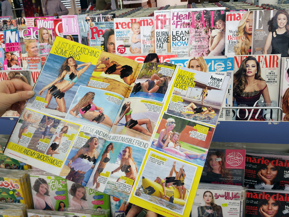
One thing that stood out to me during my trip was the magazine stand at the checkout of a Carrefour store (which reminded me of my local Loblaws or Safeway). The plethora of magazines was remarkable, but not for the reasons you may think:

Image showing magazines with sharpie covering parts of women's bodies.

These magazines don’t look the same in Oman as they do in North America

Someone had taken a big Sharpie and meticulously hand-modified every image on every page of every copy in order to cover up parts of women’s bodies. Of course, as pointed out by Dr. Aisha Sherazi, an Ottawa writer and pastoral care worker I corresponded with while writing this piece, there are different interpretations of Islam’s teachings and so the religion is practised in widely different ways. Most Omanis are Ibadis (which perhaps helps it deal with its Sunni and Shiite neighbours)–but regardless of what influenced this particular instance of modesty toward nudity, whether religious belief or something else altogether, it’s safe to say that somewhere along the chain of distribution these images were deemed to be showing more of a woman’s body than was thought appropriate for Omani culture.

These magazines are remarkable artifacts of what happens as we become one global civilization, and are an understandable reaction to market forces that create a demand for trashy magazines, combined with a localized need to conform to local standards. I imagine the magazine distributor hires extremely low-paid foreign workers to modify the magazines before they go on the shelves.

This brings up a number of things worth thinking about. Can one really sell a $5 magazine at a profit if they need to be modified by hand? Wouldn’t it be interesting to read the rules as to what must get covered and what can be left alone? Why just the women? Is it the intention of the principle behind this activity that the person wielding the Sharpie is forced to examine these images intensely in order to spare someone else having to see them? What is the role of we Sharpie-wielding designers in the West in creating a situation where so many resources (both natural and human) are being wasted in order to share questionable content more broadly?

And what of such selective censorship? What of the moral rights of the art director, whose painstaking (though perhaps crass) layouts are being mechanically desecrated with this most unexpected tagging?

Maybe such Talmudic cleverness distracts us from the larger question: how do we create a civilization where the best of our cultures can not just coexist but nurture a better civilization… whereas this is perhaps an example of the opposite… a race to the bottom, wasting both paper and Sharpies? Both dignity and focus?

And for the accessible PDF equivalent of such a magazine, what would be the alternative text for a markered-out censored photo in a fashion magazine?

So I’m tempted to say that I’m not for it or against it, just conveniently naive and looking for opinions. Not as a Muslim nor a woman, but I do love a good Sharpie…

Is this just a wacky artifact of cultural crossover? I think not. Rather, ultimately, anything that obscures the core issue is a concern: that busying ourselves covering up these naughty bits while continuing to propagate a culture that, in the pursuit of consumerism, sacrifices our young women who, no matter where they live, are taught their bodies are not okay if they are not thin enough, not white enough, not tall enough.

What do you think?

Return to top

Reviewed August 30, 2015

An unstoppable blogger keeps it rolling

Posted on

Photo of Rabbi Simes smiling

Rabbi Simes

An Ottawa area Rabbi sent me an email last night; using only his eyes.

Let me explain: I’ve been collaborating with my colleague Mitchell Bellman to help improve the quality of life for Rabbi Simes, a quadriplegic, who recently had a tracheotomy.

Rabbi Simes is known as an outstanding elementary school teacher, and is a loving husband and devoted father to eight children. In June 2010, he and his family were in a terrible car accident when they tried to avoid a deer that ran in front of their car. Thankfully all of his children and his wife, who was expecting at the time, walked away from the accident. Unfortunately Rabbi Simes was left paralyzed.

As part of his long recovery and his desire to fulfill his passion for teaching, Rabbi Simes began blogging as the Rolling Rabbi: rollingrabbi.wordpress.com. Since its advent in 2012, the Rolling Rabbi has attracted followers and reached readers from around the world. He was able to achieve his blogging and communication goals using voice recognition software.

Unfortunately, in the last year Rabbi Simes had a major setback when he was put on a ventilator in conjunction with a tracheotomy. This apparatus took away his ability to speak, and he could no longer use the voice recognition software that had allowed him to use his computer with ease. His communication was restricted to nodding or the frustratingly slow process of looking at a letter chart while someone tries to interpret what he is trying to communicate.

Here was a very clever man, and a great teacher, unable to share his ideas and wisdom with the world. This dire situation provided my colleague and I with a unique challenge that we were determined to conquer. We have been working for the past several months to not only find a way for him to resume his passion for blogging, but to find a way to help him communicate with his family more effectively.

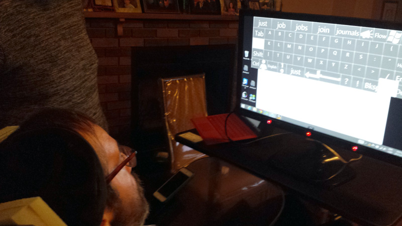
We were all thrilled when we discovered a new eye tracking device and development tool from Sweden. We were able to use the new development tool in combination with homemade software from Israel and a Windows Surface Pro to create a custom solution that allowed Rabbi Simes to blog, email, and most vitally, communicate with his wife and children again. It has been a steep learning curve and progress is slow, however it is steadily getting better and better.

Photo of Rabbi Simes staring at a computer screen showing  an on-screen keyboard.

Photo: Mitchell Bellman

There is currently no off-the-shelf assistive technology for people with Rabbi Simes’ disabilities. In many cases the technology that is available is either prohibitively expensive or incompatible with basic and commonly used software. During our exhaustive quest to give Rabbi Simes a “digital voice” we discovered there were many disabled individuals, too many, who were unable to control their computer or accessible technology, without some level of human (physical) intervention.

Thanks to the creative help of some great developers, who are themselves living with severe disabilities, we were able to find a reasonably priced solution that has already shown great promise.

Our ultimate goal is to have a setup that allows Rabbi Simes to fully control his computer, blog and email, completely independently. Every time we try out a new setup or tweak, our hope is that it is so successful that he asks us to leave all the equipment at his house. We are happy to say we are nearing our goal and anticipate we are one or two visits away from that moment. On our most recent visit, Rabbi Simes was able to send an email, control Windows, and type a few short messages. He painstakingly wrote out the names of all nine of his children and how highly he regards of each of them. Once the heartfelt messages were complete he turned his attention to improving the system and immediately requested an alphabetical onscreen keyboard rather than a Qwerty keyboard. My colleague and I were almost as excited as he was! Up until this visit Rabbi Simes’ only option for feedback was to nod in response to questions; it was a giant leap forward.

A screenshot of an email from Rabbi Simes saying" I want an alphabetical keyboard"

Rabbi Simes is currently blogging with a proprietary piece of hardware that uses an eye scanner. This setup requires someone to transcribe his writing from the device to a computer; this device costs in excess of $20,000. We hope our solution will allow him to have total communication independence at a fraction of the cost. To date we have only spent $3,000 setting up our custom system.

Serendipitously, I will have the opportunity to speak with the Swedish Team that is responsible for the amazing new development tool for eye-tracking software, Tobii EyeX. We will both be at Funka Accessibility Days. If you happen to be there too, I’d love to discuss custom solutions for accessibility!

Look for updates here, or for Rabbi Simes’ perspective on this whole process at: rollingrabbi.wordpress.com.

Return to top

Reviewed July 28, 2015

This decade has 22 minutes?

Posted on

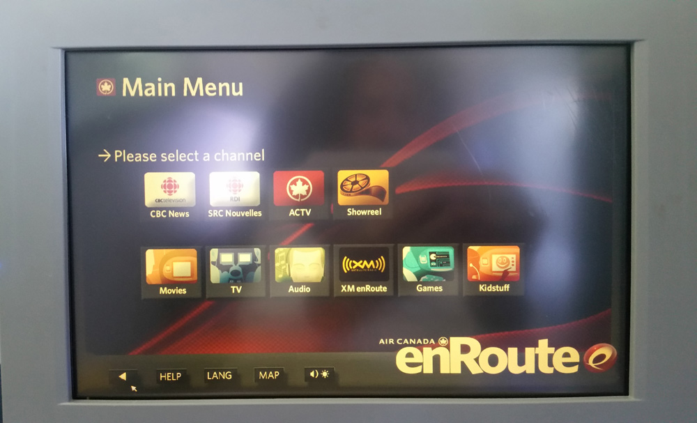
Have you ever flown Air Canada? I fly Air Canada more than most. Last week, it was Frankfurt to Ottawa on the way back from Oman (another story coming soon!). And, as on every Air Canada journey, I cynically pressed the most prominent button on the in-flight entertainment system: the “CBC News” button.

Image showing television screen with menu  options

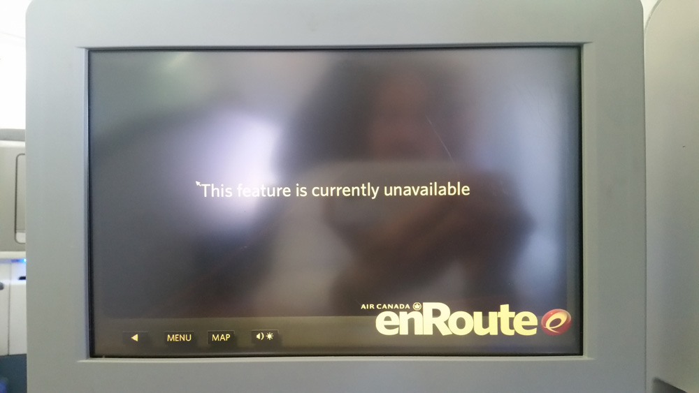
Why cynically? Let me explain: the CBC is our national broadcaster and Air Canada is our national airline, and both brands have much to be proud of, with their internationally award-winning services (and visual identities!). But for perhaps close to twenty years, I’ve been pressing that button only to receive an error message: “This feature is temporarily unavailable.”

Now the thing about “news” and especially the increasingly BYOD world of air travel (where more and more us bring our own movies), is that there is an expectation of professional maintenance crews–whether award-winning journalists or award-winning airplane mechanics. According to an Air Canada employee, the CBC News feature was added in the 1990s with good intentions but maintaining its content proved challenging.

An image showing television screen with text displayed "The feature is currently unavailable"

When does an error message become a lie?

In a world where more and more of us are bringing our own entertainment to the plane (and until the airline figures out how to give us wifi), the “news”–whether it’s CBC’s current events updates or flight-specific info like how close we are to our destination–would seem to be the most important exclusive content the entertainment system can provide.

But what I’m more concerned about is this: when does an error message become a lie? And how does that erode the integrity of the brand?

It’s not that the airline doesn’t have people updating the system regularly. The movies, the TV shows, and of course the ads for lunches that should be free (ads that are forced upon us before each film and each time the system gets rebooted, carefully forbidding us from adjusting the volume*. Don’t get me started…), seem to get updated with no problem.

After how many months is a feature no longer a feature? After how many years is “currently” no longer current?

Of course, this isn’t specific to Air Canada. Do your own products include features you should have removed long ago? Are you guilty of complacency where there are no obvious negative repercussions, leading to slow brand erosion? I know I’m guilty of it on our website.

Whether you’re an Air Canada or a CBC, who spend millions proactively strengthening their brand, or a small design agency with more limited resources, find the low-hanging fruit where small kinks in your messaging and your service promises are undermining your best intentions.

Meanwhile, I’m going to go find three areas on our website where we’re guilty of pretending (or at least we’re in denial) that something isn’t broken. Oh wait, there’s no wifi on this plane. Okay then, part three of The Hobbit it is. Where are those “May contain nuts” peanuts? Showtime…

(*A WCAG 2.0 accessibility failure)

Return to top

Reviewed June 5, 2015

My 3D printed tooth

Posted on

I was excited to share the story of my custom 3D body part on a recent trip to Goa, where I had been asked to speak about affordable accessibility design thinking at the DesignYatra conference. The body part I spoke of is now a permanent part of me.

The world of 3D printing and making continues to accelerate, opening doors to new avenues of design. For example, students at Carleton University are creating new types of custom prosthetics using the university’s 3D printers. Medical uses for custom 3D “making” are already taking hold and promising a brighter, more accessible future for many.

Breakthroughs such as the Jaipur Foot (and Jaipur Knee) have meant affordable prosthetics for tens of thousands of people. A Jaipur Foot, while lacking in aesthetics and customization, costs less than $50, compared to a leading-edge prosthetic that would be installed in Ontario for perhaps $15,000.

Such 3D technologies are the harbingers of all manner of customizable, affordable, potentially life-altering solutions for millions of people, especially in the developing world. With these, we can dramatically improve the quality of life, globally.

My 3D printed body part was made right here in Ottawa, Canada. It’s a custom tooth, replacing one I broke in a basketball game. Rather than lamenting the cost and inconvenience of getting a crown, I followed up with a friend who told me she recently had a custom-made tooth implanted instead of a conventional crown. My regular dentist knew about the process but wasn’t set up for it yet, so I located a dentist in Ottawa who was, and soon enough we were talking tooth in his office.

Image showing David’s “tooth designer” works out the kinks (left and centre); then the milling process begins (right)

David’s “tooth designer” works out the kinks (left and centre); then the milling process begins (right)

After some elaborate scanning and molding of the negative space in my mouth, I found myself in the dentist chair craning my neck to watch the dental assistant next to me working away at the program she uses to perfect the design before the milling process begins. She told me she went to college to become a dental technician, but hadn’t anticipated one day designing teeth with this amazing software. We chatted about whether she ever imagined herself a “tooth designer,” as she rounded off a virtual hill in the corner of my virtual tooth to make it look more like “me.” She said she’d never heard that term before, but agreed that indeed she was! We certainly live in an age where everyone’s a designer, but neither of us saw this one coming.

After we agreed on the tooth design, we enjoyed watching the milling process (they proudly have the machine behind glass in the waiting room) — it took under ten minutes, and then the dental team promptly installed it in my jaw.

I walked out of the dentist office that day confident that we live in a time where the medical successes of the rich will be more and more easily replicated for those who are not so wealthy.

Whether you’re a print designer, a Web designer, an industrial designer, or a tooth designer, we owe it to ourselves to embrace what becomes possible when 3D making becomes increasingly ubiquitous.

The early victories of 3D printing will certainly be about driving down the cost of making and delivering things we already know. Certainly Gutenberg (TIME magazine’s Person of the Millenium) wasn’t trying to start a revolution when he invented moveable type; he was just trying to make money by producing cheaper Bibles. Indeed, for the first 50 years of Gutenberg’s press, while over 7,000 titles came off his invention, they were all simply cheaper replicas of what already existed. . .all works of biblical non-fiction. It wasn’t until the 16th century that Martin Luther would design a new kind of Bible that truly embraced the idea that everyone could afford to read, or Machiavelli would create the first fiction No. 1 bestseller.

Computers similarly started creeping toward affordability in the 1950s. IBM and American Airlines drove down the cost of booking and printing airline tickets and many companies have replicated similar efficiencies since, but it took three more decades before we started doing things that had never been dreamed of before with the technology. . .such as the Internet.

And so it will be with 3D printing: yes, we’ll produce dental crowns faster and cheaper, but soon these replicators will be overwhelmed by objects and customizations and localizations never before dreamed of. Why not put a Bluetooth microphone inside that custom tooth? Re-arrange molecules to create new tooth materials that have never existed before? Could my tooth someday tell my Fitbit what I just ate?

Maybe the possibilities are more than you want to chew on today (a Google search of 3D innovations can easily overwhelm), however 3D making could indeed become the greatest opportunity that designers have ever bitten off. What will you create?

Return to top

Reviewed March 19, 2015

Sara: A Canadian app that brings search power to the offline world

Posted on

Right after speaking at RGD’s recent Toronto conference on Web accessibility, I was exposed to a very exciting made-in-Ontario innovation that I want to tell you about.

In my talk, I was dwelling on the reality that while in the developed world we tend to think of Web accessibility as “accessibility for people living with disabilities,” in many parts of the world accessibility can simply be about getting online in the first place. As Nicholas Negroponte reminds us, for close to 70% of the world’s population the Internet still remains a rumour.

And yet that will change. By the end of this decade, the majority of humanity will be online. So when Jessie Richards came up after my Q&A and told me about her involvement with a Toronto team and how they are tackling Internet and mobile answer accessibility problems, I got really excited about the award-winning innovation.

A do-good hackathon

In September 2014, Pakathon, a social good hackathon held in 16 cities from around the globe, hosted its first annual event in Toronto. The goal was to bring tech-savvy young professionals together for a weekend to hack on tools that could solve everyday problems in Pakistan, big or small, and could be adopted in other developing areas as well.

Out of this hackathon was born Sara, an SMS-based instant-answer platform that was named the winning Toronto team project (later taking third place in the final round at MIT in Boston). Sara is a chat-bot that queries several directories, databases and search engines to find the best possible answer to a user’s question. For example, you can ask Sara for the weather, restaurant reviews, nutritional information, and even answers to your algebra homework. But, more importantly, Sara can answer high-impact hyper-relevant questions for those who need answers but don’t have Internet access.

The Sara app could help bring the power of Web search to those with limited or no Internet access

Sara’s start

The need for Sara arose from trying to solve one major accessibility problem. “When our team got together to brainstorm what kind of application we could build we kept running into the problem of mobile data connections in the developing world,” said Ahmad Iqbal, team leader. “We had tons of great ideas but at the end of the day they wouldn’t be useful for the masses that don’t have smartphones or access to data networks. That’s when we realized the solution lay in an SMS-based platform.”

For a farmer in rural Pakistan who sells his seasonal produce in bulk to a broker, his limited access to information prevents him from getting a fair price for his goods. In another example, a mother in the middle of a West African village may not be up on the warning signs and symptoms of Ebola, and may end up spending her week’s or month’s salary trying to get to the closest doctor over a false alarm. These major problems have very simple solutions; access to the right information, however small, can mean a world of a difference to many millions of people every day. Although Sara is still in a prototype stage, a crude integration with commodity prices and WebMD has already been developed.

When asked what the next steps for Sara were, Iqbal said, “Currently we’re integrated with Wikipedia, Wolfram Alpha, Google, Yelp, and WebMD. We’re currently focused on giving Sara the ability to learn, so that as she gets smarter her answers get more and more relevant and succinct.”

Meanwhile, design thinkers from across our land continue to punch above their weight class in helping spread the power of the Internet to all of humanity. I’ll have more stories on design doing good in the coming year. It’s been a great year for Do Good Design, and I look forward to doing even more in 2015!

[Image via Sarahtells.info]

Return to top

Reviewed January 13, 2015

stopgap.ca: “Sure we’ll 3D-print you a ramp!”

Posted on

Image of two stopgap.ca ramps outside a store.

Whether for people with mobility aids, parents with strollers, or couriers with dollies, StopGap eases access to single-stepped storefronts (Photo: Luke Anderson)

How can you not love a crowdsourced accessibility project with a fun guerrilla marketing edge, that’s made-in-Canada with brilliant branding?

That’s what I thought when I first met Luke Anderson and his large, surprisingly lightweight, triangular wedge, spray-painted with “stopgap.ca”.

Luke’s invention is a “stop gap” measure, a ramp for wheelchairs (and other mobility challenges) that can be put in place quickly where needed; allowing everyone to boldly go where they’ve not been able to go before. Even better, stopgap.ca encourages and enables pretty much anyone to identify where ramps are needed in their community to overcome single-step barriers, and then easily make one of their own. The visibility of a StopGap ramp, with its bold and clever branding, brings attention to the wider issue while also providing the recipe to join the movement.

Due to physical barriers, our built environment prevents many people from accessing the spaces that they desire. StopGap’s mission is to help communities discover the benefits of barrier-free spaces and provide support to help people remove those barriers.

Photo of Luke Anderson meeting people at the Carleton Summit.

Founder Luke Anderson at Ottawa’s Accessibility Summit earlier this year​ (Photo: David Berman)

Crowdsourcing access: one step at a time

The StopGap Foundation was registered as a charitable organization in October 2013, but its roots date back to the fall of 2011. Luke started his first Community Ramp Project in Toronto’s Junction neighbourhood. Through material donations from local hardware stores and volunteer labour from inspired community residents, the Community Ramp Project was able to deploy ramps at no cost to 12 businesses with an inaccessible single-stepped entry.

The inclined plywood planes were brightly coloured to attract attention, stenciled with the project’s URL in order to direct everyone who sees the ramp on the street to learn more about the project. Since then numerous Community Ramp Projects have been launched with great success in various Toronto neighbourhoods as well as communities in other provinces including B.C.

Our hope is that a cross-Canada initiative will help pave the way for a more inclusive society free of barriers that prevent many people from experiencing all that their communities have to offer.

Let’s ramp it up

Will you join us? Imagine what becomes possible when the design community ramps up this initiative: it will influence policymakers to change current prohibitive legislation which creates a very difficult and costly process for any property owner interested in creating permanent barrier-free spaces.

Before long, we could be 3-D printing ramps all over the…wait. Egad: our own building is out of step! Gotta go build a StopGap—who’s in?

Return to top

Reviewed December 1, 2014

Everything I needed to know about do good design, I learned from my dad

Posted on

My Dad’s 85th birthday passed just a little while ago. I can remember back when he introduced me to stamp collecting. I was just five years old, and I don’t think he realized that he was actually introducing me to a lifelong love of graphic design, typography, printing techniques … not to mention a love of travel. (Social justice came later.)

Photo of the Sri Lankan stamp seller showing his stamp collections.

In Sri Lanka, Saminda Leel Gunaratne shares his passion for stamp collecting

Discovering design in my Dad’s stamp collection

I recall it as a Sunday morning: Dad was working on his collection and I was so fascinated that he presented me an envelope of around 1,000 stamps and a magnifying glass! I spread them out all over the floor of my room, some torn from envelopes, some loose, some mint, some postmarked. They were from all over the world! India, Ceylon, Israel, USA, and of course from across Canada.

All the kids in my family were stamp collectors, however I soon far out-obsessed my siblings. Later I’d get a morning Globe & Mail route just so I could earn money to fuel my addiction to the monthly philatelic show at Ottawa’s Chateau Laurier. By then I was into watermarking paper varieties, nerdily discerning intaglio from lithography on turn-of-the-century definitive issues. It was the older stamps that intrigued me as much as the variety of places and cultures and alphabets and typefaces. It’s how I learned to distinguish printing techniques and paper and letterforms and appreciate history and culture … and how to balance a budget too. Perhaps everything I needed to learn to be a graphic designer I learned from my Dad.

Design thinking in Sri Lanka

Fast forward to last month in Sri Lanka (formerly Ceylon), on my way to speak in Goa at India’s most celebrated design pilgrimage, Rajesh Kejriwal’s DesignYatra (literally “design pilgimage” … another story!).

In my last hours in Colombo, Sri Lanka, just before heading on to southern India I insisted that we visit the War Memorial, and it was on the way there at twilight that I ran into a man named Saminda Leel Gunaratne.

Saminda was urging tourists to exchange 1,000 Sri Lankan rupees (around $10) for a small collection of Sri Lankan coins and stamps. I was happy to oblige, as I love bringing home currency and I had just a few hours left in the country. I was wrong to think he was just in it for the money–the transaction was complete, yet Saminda kept telling me about his passion for stamps from around the world and why he loved them so, and in turn I told him of my love of stamps and how they eventually led me to over 50 countries.

I told him I’d be pleased to send him some stamps from far-off lands, and asked him how many he’d like. He fell quiet. I said, “ask for what you want in this world. Please give me a number.” After some thought, he humbly declared “between one and 1,000.” And so I told him that I would send him 1,000 stamps. Which I’ve just packaged up for him and sent from my long-neglected collection.

Pay it (or mail it) forward

Wouldn’t it be fun if Saminda were to receive thousands of stamps from all around the world? Let’s make it happen. Email me or tweet me and I’ll send you his address. Or, send your stamps to David Berman Communications at 340 Selby Avenue, Ottawa, K2A 3X6, and I’ll send them on. Let’s pay forward some graphic design inspiration and shared joy.

Designing a better world starts with building trust. And great design is often about exceeding expectations.

Return to top

Reviewed November 7, 2014

How can we design QR codes that people who are blind can see?

Posted on

Photo of two David Berman Communications next event cards front and back showing the Berman Corner

Front and Back of David Berman Communications next event cards

We are proud of the amazing progress over the past decade in making accessible digital versions of paper documents available for people with disabilities. When our organization distributes a physical document (such as an evaluation form or a certificate at one of our courses), we follow the best practice of including a prominent message telling people how they can get an accessible electronic equivalent. Many other organizations are doing the same. But if someone can’t see that message, how can they know the accessible alternative exists, let alone know what the document is in the first place?

Solution: Let’s cut corners!

We wanted to invent a simple, inexpensive standard that allows people to identify a physical document without using their eyes, as well as link to its accessible digital equivalent—all without the expensive and time-consuming process of adding braille.

The result of our design research is called the “Berman Corner.” Here’s how it works:

A printed document (a business card, a handout, a magazine) gets a tiny 45-degree cut of paper trimmed from one of its four corners. The cut is not large enough to get in the way of the printed message, but is large enough that a person who can’t see can notice that one of the corners is intentionally chopped. This tactile clue signals that within 3.5 inches of that corner there is a code that can be scanned, such as a QR code, that the person can activate with any barcode scanning app on their smartphone (e.g. Google Goggles). If they don’t find it on one side of the paper, they try the other side. The code identifies the document, contains all the document information, and/or takes them to the accessible equivalent online (perhaps a PDF or a Web page).

The cut corner is a very affordable approach. Scissors can be used for a single document, while commercial printers can very inexpensively shave a corner on a print job upon request. (We’d like to think that printers would even embrace providing such an accommodation at no charge.)

Meanwhile, QR codes cost nothing to create: there are many free online tools available. We’ve also invented a collaborative Google Sheet for generating free QR codes of various sizes. Contact me at bermancorner@davidberman.com so we can share that with you.

What if the person has no Web access? There is a new kind of scan code invented here in Canada by Cecitech that embeds the content of a document directly into the code itself! We’re already collaborating with Cecitech on its adoption.
This was all the result of design research, led by Khadija Safri, that included studying other attempts by public and private sector organizations to put indicators on documents, much like and electronic hotel room keys, and testing various prototypes with people who are blind. Regarding the size of the cut, we tested a range of shapes, sizes and positions. Thank you Kim Kilpatrick for your help during the process!

Result: Early excitement

At the recent International Summit on Accessibility 2014, I distributed a couple hundred cut cards to the audience, without explanation, and also handed out business cards in the corridors; the cards featured the Berman Corner as well as braille that explained the approach. We had visually impaired reps from several levels of government follow up with us, enthusiastically reporting that not only did they “get it,” they wanted to look into making it a standard within their organizations.

As usual, when we design for the extremes, everyone benefits: sighted users can also find benefit in having a QR code link to an electronic equivalent on every document, and so we anticipate that giving up real estate for that part of the solution should be welcomed by all.

And we’ve just begun: we’ve posted full instructions on how to apply the standard to your next project. Please try it, tell us how we can improve it, and post your examples!


Return to top

Reviewed September 5, 2014

International Accessibility Summit closing remarks

Posted on

Just before Rick Hansen took the stage earlier this month to close Carleton University’s International Summit on Accessibility 2014 at Ottawa’s Convention Centre, I was introduced by Adrian Harewood to provide my parting thoughts on how technology had been presented at the Summit. Here’s my speech…

Photo of Rick Hansen at the end of bungee rope.

“I can’t feel my legs!” Rick Hansen’s bungee-jumping video he closed the conference with… see the YouTube video.

Thank you, Adrian. I was asked to give my take (and my “aha” moment”) regarding the technology theme of the Summit.

I’ve been part of technology conferences on five continents, and I’ve learned more, by far, at this conference than any other I’ve attended. I’m proud of my country, proud of my province, proud of my city, proud of my school, proud of my colleagues, proud of my friends!

I was on the way to the speaker ready room yesterday to seek help with a broken laptop (a “first world problem”) and happened to get talking with Isabelle Ducharme who was preparing her presentation. Isabelle uses a Jaco robotic arm developed in Montreal, attached to her wheelchair. Imagine my delight as she showed me how, for the first time in 25 years, she has the power to pour herself and drink a cup of coffee, unassisted.

Indeed, more people have been liberated in the last 25 years by assistive technology than all the revolutions and wars in the history of humanity.

We all know people who owe their lives to technology. I have a lifelong best friend from childhood, we grew up together right here in Ottawa… when we were kids, because of his developmental challenge we had to go to separate schools. Today, in Ottawa, my friend and I would be in the same classroom, part of the next generation growing up in a city where a combination of technology and courageous change in school board attitudes is changing how we roll here: Kids growing up in a world where they’ve known nothing but inclusivity.

And today, through the convergence of mobile devices, clever software, and courageous persistence, my friend is now reading books on his own for the first time in his life. And I have more innovation to share with him from these past three days…

At the conference, I saw technology that makes what I show in my presentations pale … dozens of remarkable innovations: and not just in the digital accessibility field that I know best: innovations like the 3D-printed affordable prosthetic limbs designed by students. The next generation of inventors includes the student who told me “we’ll 3D print you a ramp!”… yet more evidence for me that Carleton University is en route to being the most accessible university on Earth.

As this next wave of inspiring technologists joins the professional world, I was calculating that over 95% of the designers and engineers and programmers who have ever lived are alive today. And it’s up to us to define what each of our professions will be about.

We are inventing the future together. It’s been a remarkable and inspiring Summit and, like most of you, I’m leaving the conference involved in several new multidisciplinary collaborations … born from the remarkable cross-pollination of varied areas of expertise brought together by our common belief in a better world.

I’m convinced that the Summit will NOT end today: rather it will continue in hundreds of projects and connections enabled by the elevation of discourse that we’ve achieved together over the past few days.

There have been perhaps 10,000 generations of homo sapiens. I cannot explain the fortune that has allowed for you and I to be alive together in this 10,000th generation… the first generation where we have the power to use our inventiveness to perhaps overcome biology, to even overcome fate…

Which brings me to my aha moment… At the banquet last night, amongst the dancing and music, Jody Mitic shared his inspiring motivational story of how he has courageously overcome his injury from his second tour in Afghanistan. He told the story of how the enemy had got to him, with a cleverly designed land mine that, in one terrible moment, destroyed both his legs.

Imagining that moment really made me pause and think about of how we humans have an enormous and urgent choice to make:
We can use our creative powers to invent tools that destroy and disfigure and humiliate and intimidate and create fear…
We can waste our creative powers distracting ourselves from society’s most urgent problems, creating products no one really needs…
Or we can use our ingenuity and our opportunity of this moment, living in this culture, living in this privileged place, to choose to create a better civilization together… a civilization that loves and embraces and emboldens everyone. A civilization that, just like Jody Mitic’s comrades, refuses to leave anyone behind.

That is exactly what we have been creating together over these past four days and what we can continue to do. And because we can, we must.

Thank you all, so much (and especially Dean Mellway for recruiting me in the first place) for allowing me to be a part of organizing it!

Return to top

Reviewed July 28, 2014

Norway passes Ontario … on Canada Day no less!

Posted on

Image of an accessibility sign on the floor near the luggage carousel marking a reserved space for accessibility.

Stockholm Arlanda Airport, where the luggage carousel design reserves space for accessibility (Photo: David Berman, 2014)

I just got back from a tour through Scandinavia, instigated by today’s co-blogger Marius Monsen. I met Marius at a workshop in Oslo in 2007. He’s currently leading UX at Vizrt, a company you’ve probably not heard of even though you see its work every day. Vizrt is the outfit that figured out how to virtually insert the first-down line on football broadcasts. It makes the tools that BBC, CNN, ESPN, and thousands of other broadcasters around the world use to create real-time 3D graphics, virtual studios and such.

Marius alerted me to the Norwegian legislation on ICT accessibility coming into effect this year, and invited me over to Bergen, Norway to run a workshop on online accessibility.

Here’s what Marius and I have to share…

Look to Norway

Canada has been a global leader in accessibility culture for many years. However, on Canada Day, Norway arguably will pass Ontario in one very specific area, with an unprecedented legislation regarding, among other things, web accessibility.

Notwithstanding some delays due to economic concerns, July 1, 2014 is the big deadline for Norway’s “Discrimination and Accessibility Act.” It goes further than Ontario in that Norway is demanding that private sector companies with web sites targeting the general public comply not just with WCAG 2.0 Level A (as is the requirement in Ontario), but also with the 13 additional criteria of WCAG 2.0 Level AA. It is the most ambitious digital accessibility legislation in human history.

In addition, the regulation does not limit compliance to organizations of 50 employees or more, as it is the case in Ontario. In Norway, there is no minimum size of company affected. This suggests that even Norwegian bloggers, as long as they are registered as a company, will have to follow these new standards. That’s how it reads, anyhow.

Naturally, the Supervision of Universal Design, the tilsyn (official government agency) that oversees the legislation, does not have the capacity to enforce the Accessibility Act on every website or ICT solution. It will undoubtedly focus on larger firms first. The director of the government agency says it will target public service sites like official government sites, banks, and public transportation, often imposing daily fines if their deadline for a fix is not honoured. The agency is definitely facing a challenge – it’s comprised of only 10 persons, with a budget of 11 million Norwegian kroner (around $2 million). Existing solutions are grandfathered to January 2021.

Here’s the unofficial translation to English of Section 14 of Norway’s Discrimination and Accessibility Act.

Congratulations, Norway!

Just as Ontario’s AODA represents a huge opportunity, both spiritually and financially, for Canadian designers to become leaders in the export of inclusive design, so it is that the Norwegians have an opportunity to help all of Europe and beyond create user experiences that accommodate (or better yet, delight) everyone – while driving down costs and improving search engine optimization.

It makes sense that agencies selling UX and development services, like ad agencies consultancy firms, would benefit from embracing and taking a strong position in this field. Accessibility is at the stage that usability was at perhaps a decade ago. At the time, most clients thought it was a “nice-to-have” but most didn’t really get why it mattered. So the willingness to pay for that kind of service was low. Now, strong usability is a natural part of any interactive product release. The same will happen for accessibility, but at an even faster pace due to legislation.

The whole world is watching

How can we work together to get more countries to follow Canada’s and Norway’s examples? The answer is two-part. The business world needs to see that there’s actual great return on investment in creating good, universally designed solutions. So it’s especially important that things go well in both Ontario and Norway … not just because the world is watching but also because it is quite simply the right thing to do. Accessibility legislation is valuable and will speed the process toward doing the right thing. But the best way of getting there is for we designers, developers, content owners, managers – everyone one who owns a part of the process – to embrace this remarkable opportunity to do good. Legislation or not.

More about today’s blogging partner:

Marius Monsen has spent over 15 years doing graphic- and UX design in Norway, spanning sites for travel destinations, online insurance and banking services, to apps for broadcasters, and game design. He’s passionate about making things attractive, usable and accessible. Now he is Global Head of UX at Vizrt, the company that makes what you see on TV possible.

Return to top

Reviewed June 27, 2014

Making YouTube video accessible

Posted on

May 15 is Global Accessibility Awareness Day (GAAD), so it’s the perfect time to share some tips on designing accessible experiences.

Lately the question we’ve received most on that front is whether it’s possible to make a YouTube video accessible, and if so, how? To put a finer point on it, we’re talking about embedding an accessible YouTube video and the YouTube player on a website.


David Berman demonstrates five reasons why we should care about digital accessibility. For a version of this video with audio description, visit wcag2.com

Not too long ago the answer was a sad “No,” but now I’m pleased that we can say “Yes… if you follow a careful recipe.” Here’s a DIY recipe based on the same procedure my team uses for our clients.

You’ll understand the recipe more easily if you understand the challenge: we not only have to make the video itself accessible (with transcripts, captions, and/or descriptive video); we also have to make sure the player itself has accessible controls.

Youtube.com itself is, unfortunately, not a sufficiently accessible website (for example, it fails the Focus Visible criterion), so sending audience members there for an accessible alternative won’t work.

Instead our plan is to embed an accessible video in an accessible configuration of the YouTube player, directly within your web page–all this to comply with the pertinent Level A criteria of WCAG 2.0 (1.2.1, 1.2.2, 1.2.3, 2.1.1, 2.1.2) and perhaps also Level AA criteria as well (1.2.4, 1.2.5). If you’re striving for Ontario’s AODA compliance, consider that AODA currently exempts 1.2.4 and 1.2.5.

Step 1: Solving the keyboard navigation challenge

YouTube offers several versions of its embeddable player, including an HTML5 version and a Flash version. The Flash version is not accessible for people who must use a keyboard to navigate (it fails both the Keyboard rule and the Keyboard Trap rule on all major browsers). However, the HTML5 version is accessible.

Conveniently, the HTML5 player is automatically used on Android and iOS devices. For other devices however, we need to force its use by following these three steps:

1. Upload your video as an mp4 file, no other format (if it’s already online, download it as mp4, then reupload)

2. Change the HTML code that embeds the player from src=”//www.youtube.com/embed/VIRx3RJzbZg” to src=”//www.youtube.com/embed/VIRx3RJzbZg?html5=1″ (swapping in the unique code that YouTube supplies for your video)

3. Because there are some situations where Internet Explorer and Firefox will still fail to load the HTML5 player, add this audience-readable sentence, in a small type size, immediately preceding the first video on each web page that contains video(s): “For a fully keyboard-accessible alternative to this video, view it in Chrome or on any Android or iOS device, view it in Firefox with the YouTube ALL HTML5 add-on installed, or disable Flash in Internet Explorer.”

Step 2: Making excellent captions, the easy way

YouTube has the magical ability to automatically generate fairly accurate captions for uploaded videos, saving you much effort and drudgery. However, these automatic captions are never good enough, and sometimes quite bad if there are multiple speakers or background noise.

We’ll start with what YouTube provides, then improve upon it manually.

1. Upload your finished video (never start captioning until the video is final!) to your YouTube channel. Set it to Private (as we don’t want to share it with the world yet), then wait several hours for YouTube to generate its captions. The longer the video, the longer it takes.

2. Now, use YouTube’s caption editor to clean the following:

  • Words: fix spelling, and remove “ummms” that get in the way of understanding
  • Pacing: shift words to the next or preceding caption to ensure complete phrases never bridge two captions (i.e. nouns and verbs are connected to their modifiers, and prepositional phrases are not separated)
  • Consider deleting any time segments which are left blank, then select the timer on your full-sentence caption and increase the time to run for the duration of the full sentence. The idea is to steal time from pauses to fit in the full text, in situations where it’s difficult to get all the words in… but not to go as far as to replace pauses that are part of “the story”

Captioning is an art, however here are some guidelines to help you get started:

  • No caption should appear for less than two seconds
  • Add descriptions of sound in square brackets (such as [music] or [laughter]) to help people understand what is happening
  • If there’s more than one speaker, add tags like ”>>BERMAN:”, at the beginning of a new line, to identify speakers or change of speaker
  • If someone is spelling a word, caption it with hyphens, as in S-P-E-L-L-I-N-G

Step 3: Adding a descriptive transcript

To achieve Level A compliance, you need to include either a descriptive text transcript or an audio description (WCAG 2.0 1.2.3). Most people will choose the former because audio descriptions take more effort.

YouTube wonderfully provides a transcript button, enabling the viewer to read all the captions in one place. But a transcript of just the captions is not sufficient: we need descriptive text transcripts.

So what you’re going to do is take the complete transcript of your captions and add descriptive text that relates what else is going in the video (“location shot”, actions, body language, scene changes, etc.). Then add a “Transcript” button directly below the video on your web page, and have it link to a separate HTML page containing the transcript.

To see an example of what the finished product will look like, visit davidberman.com/accessibility.

How to create the descriptive text transcript:

1. Go to the YouTube video’s Transcript (select the Transcript icon) and copy and paste it to a text file.

2. Use a text editor to remove the timecode by hand… or save time by downloading the .srt file from YouTube’s caption editor, and using the free software Aegisub for Windows, Mac, or Unix (download at Aegisub.org) to remove the timecode.

3. To avoid broken sentences, search and replace any extra hard-returns. Also replace all line endings with single spaces.

4. Insert any descriptive text (you can conveniently take text from an audio description script if you happen to have one). For example: “The speaker is sitting in an armchair in front of a fireplace. Throughout the entire video, he addresses the camera directly.”

5. Insert the resulting text into the page on your website that is linked to the “transcript” link below the video.

Keep in mind that you could have, instead, provided an audio-description version (or perhaps even a Level AAA extended audio version) of your video, in which you don’t need a descriptive text transcript. (For an example of an extended audio description, please see the video at wcag2.com.) We’ll explain how to script and record your own audio descriptions in a future article!

So there you have it. A recipe for accessible video, without losing all the convenience and reach of YouTube! Have deeper questions on this? Ping me!

(Thank you to Heather McAlister at Carleton University for her help with this blog post!)

Return to top

Reviewed May 21, 2014

Can jewellery design do good?

Posted on

My daughter wanted to put a permanent bumper sticker on her body.

She was in first-year university, studying graphic design. When it comes to body adornment, I’d rather she chose the earrings I brought her from Beijing rather than a tattoo.

What I do know is that when I die, my legacy to her will include a box of precious and meaningful objects, most of them jewellery. There will be the antique pocket watch my Aunt Edith gave me when I was 12. The crystal my cousin Leslie hung around my neck at our first hippie Rainbow Gathering deep in a forest in North Carolina (in the 10,000-year tradition of amulets warding off evil) hanging from a $2 strip of leather that my best friend Steve gave me when I was 22. There will also be the Movado Museum watch I wear most days: a gift from a business partner, now passed away, who taught me a lot. I think he figured it would help me sell more design, and it probably did.

I don’t know a lot about designing jewellery, but what I do know is that jewellery design, like graphic design, is political. It’s personal. It’s powerful. It’s fundamentally social, and thus also about social responsibility. It’s about a broader definition of sustainability that includes culture, the environment, and ethics.

There has never been a better nor more important time to discuss responsible design. Back in 2001, when I first spoke about ethics at a design conference, my speech was a maverick presentation: the only one about socially responsible design. Just six years later, I moderated a social responsibility theme day at the World Design Congress and almost every speaker at that conference tied his or her work to the difference that designers can make in the world.

In the graphic design field, over the past two decades, we’ve succeeded in changing how the world perceives our profession. Twenty years ago, we were graphic artists: today we are professionals (often with certifications and codes of conduct).

Yesterday we were struggling to be seen as serious. Today we are seen as critical to adding value to corporate balance sheets. I suspect that jewellery designers, like others in craft, are early on within a similar transition.

Don’t just do good jewellery … do good!

Imagine what is possible if jewellery designers, artists, craftspeople, merchants and distributors, decided that the jewellery of indigenous and small-scale communities would not only be sought out, but that its production would be cultivated, supported, and that it would be fairly sold.

Imagine that certified labeling would be required to support the claims of authenticity, and that these labels would be issued only by the cultural group in question.

Imagine that the globalisation of jewellery doesn’t mean that those with access to mass production can copy and displace (with cheaper products) the beautiful and unique products of our amazingly diverse cultures, but instead that we would see the diffusion of unique authentic cultural treasures into a wider global culture in a way that materially and culturally enriches small communities, and spreads their cultural riches throughout our global village.

Graphic design meets jewellery design

What and how we design and market affects society. Whether as designers or jewellers, some of us choose to focus purely on the aesthetic of our creations. I know that simply creating beautiful objects, or surrounding yourself with beautifully-designed objects, can help create a seemingly fulfilling and comfortable life. However, that is only the surface of the potential good and sense of accomplishment you can achieve with your creative skills.

We live in a truly remarkable time. It has never been easier, never less expensive, never more immediate, to create products, and to make them available to large and distant populations. The Internet represents not only the democratization of the marketing of jewellery, but also the democratization of mass manufacturing and customization.

Will that sharing be of the idea of jewellery as an indicator of wealth and privilege, or of a deeper connection for humanity?

Will that sharing be of clasps that are increasing difficult for an aging population to use, or of a deeper recognition for accessible design?

Will that sharing be simply an echo of the cacophony of convincing ever-growing populations in the developing world that they need to consume stuff — lots of stuff — in order to feel they belong in the global culture? Will we prop up the greed disorder of the minority, by using our cleverness and creativity to help convince more and more people that they are not tall enough, thin enough, white enough, curly enough, cool enough…? Or will we share a new spirit of abundance and truth, dignity and equality, sustainability and justice?

Return to top

Reviewed April 28, 2014

How Online Accessibility Can Influence Brand Design

Posted on

When great designers design an excellent brand, very often the mandate includes a long and strong shelf life. If you need your brand to perform for at least a decade, you’ll want to build accessibility into its core attributes. This way you gain all the benefits while also avoiding regulatory pitfalls.

When it comes to communication design, there is nothing harder to fix than a broken identity. Typos on the Web can be corrected easily. Errors in a printed brochure, at worst, may call for a wasteful and inconvenient reprint. However if your brand design has ignored accessibility principles, you’ll have a much broader, ongoing burden to deal with.

Let’s take a look at three key issues where brand meets accessibility, using the new identifier of Canada’s National Arts Centre in Ottawa as an example. (No, I’m not going to wonder out loud why they’ve replaced such an awesome piece of great Canadian design with a shark fin … I haven’t seen the strategic brief … we’re just talking accessibility here.)

Image of a new identifier (logo, wordmark and tagline) for National Arts Centre

New identifier for National Arts Centre (logo, wordmark and tagline) introduced February 25, 2014, as the Centre approaches its 45th anniversary.

1. Consider colour contrast ratios:

International standards declare a minimum colour contrast ratio of foreground and background colours. If your design team hasn’t satisfied that ratio, not only is going to be difficult to claim your online presence is accessible: everything from annual reports to outdoor signage is going to be challenging for the huge portion of your audience with visual impairments or colour deficits.

Over 10% of men have some level of colour deficit. And we’re all colourblind when we’re looking at a photocopy or fax.

Image of a new logo for National Arts Centre

The new logo for Canada’s National Arts Centre

So make sure that every variant in your brand book (including the variations where colours are reversed or expressed in greytones), as well as your standard slogan treatments, comply with the WCAG 2.0 Color Contrast 1.4.3 guideline of a colour contrast ratio of at least 4.5 to 1 (3 to 1 for 18 point or larger … 14 point if bold). It could be even better business to strive for the Level AAA WCAG 2.0 Color Contrast 1.4.6. (Technically, the contrast rules only apply to machine text, so in many cases you’d not be strictly violating WCAG 2.0, however the spirit of these guidelines are to ensure that everyone can perceive your brand…it’s simply good marketing to make sure your brand presentation complies.)

My favourite tool for checking colour contrast (it’s free and works on Windows and Mac) isPaciello Group’s  Colour Contrast Analyser.

On a related note, differentiating product names based on colour could be a mistake: for example, designating levels of a service as “Red”, “Blue”, and “Gold” may be an ongoing burden in having to provide accessible equivalents (and avoid confusion and loss of intrigue for many audience members).

Anyhow, the National Arts Centre’s new typography passes this test with flying colours (sorry!). One for one…

2. Think through your acronyms carefully:

If you’re considering naming your organization or product with an acronym, or you anticipate that you’ll be referring to it as an acronym, think carefully how it will be pronounced by screen readers.

Not long ago, screen readers were only a concern for that portion of your audience who can’t read (either due to a lack of eyesight or a lack of skill). However in a world where everyone’s mobile devices are now offering the ability to read out loud, it’s important that machines that don’t know your name will pronounce it as you intend.

If you’re IBM, then you’re well known enough to be in the exception dictionaries of Google Now and Siri and JAWS as “I.B.M.” rather than “ibbmmm”.

Chances are your company or product aren’t that famous. Which means that you’ll be at the mercy of a screen reader algorithm to decide how to pronounce your name. Think “St. Lawrence College” being wrongly announced as “Street Lawrence College” for example.

Screenshot of a use of NAC abbreviation on the National Arts Centre website

Unfortunately, the National Arts Centre regularly refers to themselves as “NAC”, which they like to hear as “N.A.C.” but will unfortunately be announced by most screen readers as “knack” … unless extra coding is added to every instance, and even that won’t completely avoid the problem. Now, after 45 years, I’m not suggesting they should rename the organization for that single reason, however best to avoid the issue from the get-go to avoid both embarrassment and lost searches and sales. Research your proposed name and spelling of it carefully by having these prominent screen readers announce them to see if you’re pleased with the result … including testing in every language that matters to you.

If you have little choice but to go forward with a name that doesn’t announce well, mitigation is possible. For example, we can careful code Web sites and PDF files to include alternate pronunciations for assistive technologies. Of course it will be easier and more reliable to choose names that avoid this issue entirely.

3. Don’t rely on uppercase

If your clever naming relies on capitalization to ensure that people read it right, you may also have a branding liability. Someone listening to your name (whether due to using a screen reader or a radio report) won’t have the nuance of uppercase and lowercase to know what your intention was.

Image of a new identifier (logo, wordmark and tagline) for National Arts Centre in black and white colour

The National Arts Centre wisely avoided this problem, by not playing such games with their branding… when spelled out in full, whether seen or heard, the name is clear. Not so with the acronym (see above!).

So, although creative capital letters within a word may add intrigue to your brand, don’t rely solely on the creative use of capitals or the nuance of a particular typeface for an essential part of your brand name. If the brand promise or core message is lost on those who aren’t looking at your name, it’s likely an opportunity cost not worth taking.

Brand on, designers. And let’s be careful to not leave any audience behind. Don’t just do branding, do good!


Return to top

Reviewed March 26, 2014

The Eh to Zed of Canadian-designed Invention

Posted on

Photo of a Robertson screw, half-sunk into a wooden board.

The Robertson screw is one of many examples of Canadian design that the entire world would benefit from embracing.

With all of the recent talk about Canada’s great design heritage in relation to the Canada 150 campaign controversy, along with the chest-thumping nation-wide pride resulting from the Winter Olympics in Sochi, I’ve been inspired to further demonstrate our country’s history of innovation, in honour of this week’s Heritage Day in Canada.

Here is my A to Z list of inventive Canadian design-thinking world firsts (sometimes I couldn’t resist including a runner-up!). The majority of innovations also belong in the category of Do Good design!

A. alkaline battery, AM radio

B. basketball

C. Canadarm, computerized braille

D. Digisync (Emmy and Academy Award-winning motion picture bar-code reader), digital camera

E. egg carton, electric wheelchair

F. five-pin bowling

G. garbage bag, gas and goalie masks

H. hydrofoil boat,  hand prosthetic

I. Imax, instant replays and mashed potatoes

J. Jetlev water jet pack, jolly jumper

K. key frame animation, Kryptonite (and Superman)

L. lacrosse

M. McIntosh apple (the fruit, not the computer), medicinal insulin

N. Nanaimo bar, Newfoundland time (and standard time in general!)

O. oven (electric), overhead-powered streetcars

P. Pablum, (oh, how do we choose? … pacemaker, pager, paint roller, Plexiglas, poutine…)

Q. Quasiturbine

R. Robertson screw, rapeseed 00 (aka canola!)

S. SONAR, snowblowers and snowmobiles (did we invent snow days?)

T. table hockey, trackball

U. Uno motorcycle

V. Velcro

W. walkie-talkie, wheelchair accessible bus

X. the letter X in Nick Shinn’s Richler HandTooled typeface, Xbox edition of Trivial Pursuit

Y. Yukon Gold potato

Z. Zamboni, zipper

… and the 56K modem!

I’d love to hear about more Canadian-inspired firsts. Leave yours in the comments below.

Return to top

Reviewed February 18, 2014

Petition for another 150 years of Canadian Do Good Design

Posted on

Adrian Jean (GDC president) and I were chatting last month in Montreal about the impact of Canadian designers on doing good globally. So when the Canada 150 logo issue erupted, I invited him to join me this month to write about this topic together… – David
It’s rare that graphic design gets so much coverage in the mainstream press.
The largest potential damage to Canada’s brand internationally in 2013 was likely committed by Rob Ford. In 2014, professional designers have the opportunity to help avoid our own Federal Government from shooting our brand in the foot.
The Federal Government is building the visual branding for Canada’s 150th anniversary celebrations. Apparently, the government engaged an internal team to develop what appear to be logo identities to be focus group tested. The artwork that was tested were only “logo elements” and not fully formed logos for consideration.
5 different designs for Canada 150 logo

Canada 150th anniversary logo concepts being focus tested

Assessing a logo on pure aesthetic grounds is a very personal process and perhaps not appropriate for commercial art. Rather, aesthetics must be part of a larger strategic conversation. Professional designers know this, and design buyers should too. Yet the government’s process for developing this auspicious identity appears to miss this important mark entirely.
If the brief for the project was as simple as “Design a logo for Canada’s 150th birthday” then perhaps one could argue, and it would be a stretch, that the logos presented solve that brief. However the real problem is not with the work: it’s with the approach to strategy. We all know that clients can be challenged with authoring clear strategy: this is where we as professional designers often have the greatest impact.
Canada’s history is peppered with great moments in design leadership. Some of that leadership is apparent from the marks themselves: Expo 1967, the Centennial Identity, Canada’s Federal Identity Program—the list goes on. Equal in our leadership is our punching above our weight class in establishing codes of professional practice and social design that have been mimicked around the globe. We should also be terribly proud of government policies that have led the world in inclusive design that seeks to leave no one behind.
We have carefully established an international reputation of care and consideration when it comes to the values and benefits of excellent design. The Canada 150 project risks undermining that foundation.
We look forward to proudly celebrating our nation’s 150th birthday, and its many achievements in demonstrating how a civilization can be measured by how it treats it weakest members. Our collective creative culture is a big part of that. The 150th anniversary will come and go, however our efforts, our mark, will last for many decades.
Let’s encourage a reboot for this project, by asking the right questions and solving the problem in a way that we know is best—not by creating more logo suggestions (though the discussion has raised many excellent candidates), but by going to the core of the challenge.
The Society of Graphic Designers of Canada (GDC) contacted the Federal Government about this problem, but their response was tepid at best.
We’re preaching to the choir here. It’s our Federal Government that needs to start listening, and so we urge you to help get the word out, and add your name to the over 1,700 who have signed already:canada150.gdc.net
Screenshot of GDC website showing the number of Canadians that have signed the petition

Sign the petition and spread the word!


GDC (National) with the support of RGD (Ontario) and SDGQ (Quebec) launched this petition to convince our elected officials to develop a design advisory board with representation from this country’s professional creative communities. Solving design challenges with design thinking is what we as professionals do every day. This is what we’re good at, and our country’s creative community should have a voice in creating this enduring legacy.
We need not just designers, but colleagues, employers, friends, family—everyone who believes or benefits from the power of design thinking—to help our government hear that design has been part of the fabric of our nation for at least 150 years, and it is vital for our future as well.
The solution is simple. We need to bring design thinking from our professional creative communities into the process and build a strong foundation from which to develop excellent results. We need a national design advisory board that will guide the Federal Government to stop designing logos and start asking the right questions, then, and only then, start developing a creative strategy that results in strategic branding solutions.
Canada has a wealth of wise and strong creative voices. From our own confederation in 1867, to developing universal health care in the 60’s. From formalizing our Charter of Rights and Freedoms in 1982 and the Quebec Referendum “Unity Rally” in Montreal 1995, to the formation of new Territories in our Great North. These are just of a few of the many truly Canadian events that represent moments in our nation’s history when we’ve acknowledged that working together is our priority and our mark.
Also consider that acknowledging the power of a design advisory board may benefit us beyond seeing our way to a great identity for Canada 150. Perhaps our government will realize the benefit of a lasting national design policy, as has benefitted other innovative nations globally. One need only look at countries like South Korea, of similar population, with far fewer resources, to see how a national design policy can drive international competitiveness and innovation. But we digress…
For Canadian designers of all stripes, this issue today is our unity. With glowing hearts, we can stand together. From far and wide, let’s tell our government that developing a logo is not enough. Design is our culture. We must commit to a design process that truly honours 150 years of great Canadian design heritage.
We want nothing less than to put our best foot forward to communicate 150 years of Canadian inventive nation-building, one creative idea before the next.
(How strong is our heritage of Canadian do good design ingenuity? Watch next month for David’s Eh to Zed of Canadian do good design!)
More about our guest blogger: Adrian Jean is the president of the Society of Graphic Designers of Canada.

Return to top

Reviewed January 9, 2014

Morality: Where All Roads Lead

Posted on

I met Eileen MacAvery Kane, a New York professor of graphic design, through her excellent blog on Ethics In Graphic Design. I was so impressed with her ideas that I invited her to guest blog with us this month on morality and design. Take it away, Eileen…

Image of a book cover "Ethics in graphic designer's field guide"

Morality: Where All Roads Lead

When I first began researching for my thesis on the topic of ethics in graphic design I asked graphic practitioners and educators what they felt the most important issue is.

Everything from crowdsourcing to plagiarism to kick-backs to social responsibility was mentioned. When asked to give personal stories about their encounters with ethics in graphic design, the answers were as numerous and diverse.

In graphic design a search for ethics often turns up resources for best practices and business ethics. People tend to think legal issues can be separated from moral issues and dealt with independently. In a recent class I taught on brand identity, my students were surprised, and a few of them a bit horrified, at the daunting complexities involved in securing copyright, font licensing, and trademark.

As they dove in and discussed the implications of and differences between them, the conversation soon turned to issues of integrity. Cases like Shepard Fairey’s Obama Hope poster and Richard Prince’s Canal Zone came up. Other examples like John Williamsand Logo Garden were also raised.

Students were surprised to see that in some cases modifying artwork may be legal, but at the same time morally reprehensible.

The topic that I find to be the most interesting when discussing ethics in graphic design is what good design means. Is good design socially responsible, eco-friendly, or as Thomas Watson said, good business?

Many think good design is synonymous with making things look good—design that wins design awards.

One of the dictionary definitions of good is “morally excellent.” This leads graphic designers to a conundrum. While every profession must deal with ethics in its particular field, graphic designers are trained to make things look good.

In “12 Steps on The Road to Hell,” Milton Glaser asks designers a series of questions about what they have done in their career to make things look good—each more progressively objectionable.

He attests to the fact that he personally has taken a number of them. This leads me to ask, does graphic design require a certain moral flexibility?

Historically, graphic design has been an agent of moral and ethical thought. From the Code of Hammurabi to  to the broadsheets used to spread the word of Martin Luther, graphic design has been used to visually communicate beliefs and ideas—to inform, inspire, and delight.

During the Middle Ages campaigns like Ars moriendi were designed specifically to influence the behavior of individuals, in this case urging those on their deathbed from the bubonic plague to leave their money to the church.

The approach may be gentler, but one may wonder how much different present day campaigns are that ask their patrons to consider adding them to their will.

Since graphic designers are charged with making things look good, choosing worthy causes to work for is one way to try and take the high moral ground. With that said, taking up worthy causes and making them look good can only go so far as David [Berman] points out in his New Year’s resolution about Kony 2012.

Although full of its own controversy about the integrity and ethics of its founder, David discusses that despite being the most rapidly viral social justice campaign in human history with over 98 million views to date, there still has been no arrest of Joseph Kony as we near the end of 2013.

Messaging alone cannot save the world, but design is a powerful tool that can be used to help. It’s up to each graphic designer to decide what road they choose to travel down.

****

Our guest blogger, Eileen MacAvery Kane is a graphic designer, educator, and author of “Ethics: A Graphic Designer’s Field Guide” and the blog “Ethics in Graphic Design.” Learn more atethicsingraphicdesign.org.

Return to top

Reviewed December 4, 2013

Typefaces for the Blind

Posted on

I saw this traffic signal in Cambridge, Massachusetts last month. What does the red arrow in this traffic signal mean to you?

Photo of traffic signal showing a red arrow pointing left

We spotted some colourblind-killer traffic signals on Mass Ave. in Cambridge, Mass. (photo: Leslie Shelman).

To someone who is colourblind it screams “turn left into oncoming traffic, now!”
Eight percent of Canadian men have some challenge perceiving colours—and this number might be even higher if they weren’t being culled by such poor typography! Of course, even drivers who can see red can be confused by such a typographic miscue.
In 1996, thick smoke poured into Düsseldorf airport in Germany when its ceiling insulation caught fire. Exit signs were poorly designed and poorly positioned. Unable to find their way in the smoke, 17 people with temporary visual impairments died. It was the worst airport disaster in history, causing damage of over $900 million. Poor typography contributed to the tragedy.
On a less dire note, after perhaps 10,000 generations of humanity, we happen to be alive in the first generation where most information is available in electronic form.
This is liberating people with disabilities. A digital document can be manipulated and handled with assistive technologies that are becoming a larger part of all of our lives every day. From the microphone to the telephone to transistors to Siri, most of the communication technologies we use every day were invented to help include people with disabilities in society.
When humans commit language to paper, much meaning can be lost that would be expressed in the voice if that message were spoken. Skillful design and typography seeks to re-inject that tone of voice visually, as well as adding structure and priority to text elements.
Designers express emphasis by making letters thicker or switching to italics. We show the information hierarchy by making headings bigger than body copy.
These conventions are obvious to anyone who learns to read in our culture. But what about those with impaired vision or who can’t see at all?
Visually-challenged people can have a tough time reading text. With print, they may hold a page close to their nose to puzzle out what it’s saying. With an electronic document, they have better options. Text on an electronic document can be enlarged on screen to suit a reader’s need to see an extreme closeup .
Someone who can’t read at all can use a screen reader to have text read out loud. But how else can typography help in these cases?
Typography for All
If designers follow the emerging standards for markup, screen readers can access an overview of a document’s structure and know where the emphasis should be on a word. And there’s a great side benefit: since Google’s search engine is blind, a well-designed document or Web page will be better indexed and more frequently shared, an SEO boost.
Granted, the effort to structure your Web pages or InDesign and PDF files for accessibility takes some time to learn and apply. However, in most cases that discipline pays off with a broader audience, lower costs and simply doing the right thing.
It helps if everyone in the publishing process “gets it” because designing in accessibility every step of the way gives the best results with the least effort. Writers, editors, translators, designers, programmers, everyone has a part to play in creating inclusive, robust communications that even the blind can appreciate.
Of course, the basics of good typographic design (legibility, readability, size, avoiding justification) can help when documents become electronic. However there are new techniques and opportunities to consider when designing accessible PDFs, ebooks or HTML pages. For example:
Designing for the Web
In the early days of the Web, the limited set of fonts we could count on being installed on computers forced designers into lowest-common-denominator typefaces, or to painstakingly convert well-formed typography into text graphics—pictures of text. Pictures of text are not readable by screen readers nor search engines.
But today, we can stream typefaces (with Adobe Typekit, Google Fonts and Font Squirrel) and carefully control kerning and word spacing with HTML5. That gives us a much wider font selection so we can customize each message with less effort.
Designer electronic documents
Perhaps the most important change in our work is to become disciplined in rigorously structuring our InDesign files with styles. When you use disciplined styles, you can output an accessible PDF (or HTML or epub) that makes sense to a screen reader. Styles yield accessibility and productivity without compromising your design in any way.
There’s a side benefit here, too. The same properties that yield an accessible document enable your document to delightfully reformat itself. Whether a reader rotates a tablet, pinch-zooms a smartphone, searches with Bing, or asks Siri to read it out, the document is always ready in the appropriate format.
From spoken word to print … and back again 
Humans have been wired for spoken language for at least 50,000 years. Discovering how to share ideas in written form evolved about 6,000 year ago, and progressed to movable type 500 years ago. We now live in an age where everyone can be a publisher, and today’s screen readers turn back the clock to the spoken voice. But how can we convey all the richness and nuance of typography to a software-driven screen reader?
Anyone can pronounce a person’s name in different ways by changing the volume, cadence or emphasis of our voice… and change the meaning dramatically in doing so. But what does a screen reader do with bold, italics, or headings? Even when we follow the Web Content Accessibility Guidelines (WCAG) and carefully mark up our text with <strong> for bold and <em> for italics, the voices in screen readers don’t necessarily transmit these nuances… yet!
Why not have typefaces find their voice?
Remember when a song was just a song? Then music videos arrived, and ever since every song is released with a companion video. Perhaps it’s time for typefaces to take a quantum leap forward, with each OpenType font designating the general or specific suggested synthetic voice to announce words tagged in that typeface… whether for a screen reader for the blind or for listening to an ebook on your iPhone.
Imagine the Wedding Script typeface speaking with an upper-crust British accent, while DIN could be voiced by Erik Spiekermann. And Comic Sans … okay I’m not going there… well maybe Chris Rock? … who knows? Maybe we’ll end up, for good or bad, with Mike Myers being paid by Adobe to do the voice for a Myers Bold. Disney may even release fonts as part of movie merchandising or their e-book release of a movie… Oy. Just sayin’…
My point is that we live in a time and place where there is a huge opportunity in inclusive design to rethink how everything in the alphabet works for us. We love our ligatures… but remember that ligatures were once a technological breakthrough rather than a charming anachronism.
The future of design is inclusive
Ten years ago, sustainable (green) design was considered radical; today it’s mainstream. By the time this decade is done, the majority of humanity will finally be online, and inclusive (accessible) design will be the norm.
As Canadians, we’re proud of how our society strives to leave no one behind. Canada is a world leader in universal design, and we’ll continue in that role with innovative design thinking and courageous legislation.
The future of human civilization is our common design project. As the one species that figured out how to record knowledge, typography has a huge role to play as our technology continues to evolve.
***
If you’d like to learn all about how to create accessible, compliant Web sites and documents that can broaden audiences while complying with the new accessibility regulations, join David for hisfull-day workshop in Toronto (November 8). For more details:  www.wcag2.com

Return to top

Reviewed November 4, 2013

The Code of Ethics for designers: Top reasons our clients should care

Posted on

Last month I journeyed to Malaysia to help wREGA, the Malaysian national association of communication designers, launch their new Code of Professional Conduct, which we crafted substantially upon the very successful code in use by the Graphic Designers of Canada’s Code of Ethics and RGD’s Rules of Professional Conduct.

It was an awesome event in Kuala Lumpur, the best-attended member event wREGA event ever.

Photo of a crowd of people with right hand raised solemnly in a theatre setting

wREGA president Zachary Ong leads Malaysian designers in swearing in of their Code of Professional Conduct, 3 September 2013, Kuala Lumpur, Malaysia

At the launch event, perhaps the most dominant questions from designers were around why their clients should care that they now have a code of conduct. So I asked Zachary Ong, president of wREGA, to interview me about this. Here’s the result…the answers are appropriate no matter what country you are in, nor how long you’ve had a code.
Q. So why should our clients care if we have a code of conduct? What’s in it for them?
Perhaps the biggest benefit for clients is that hiring a member of the professional association guarantees them a breadth of minimum standards of behaviour and delivery from their designer. And it’s enforceable: there’s a grievance procedure in place they can trigger if the designer doesn’t uphold the standard.
Q. What’s an example of why a client can rely on you more with a code in place.
Basically, the code is a series of promises you are making. And one section is all about commitments to the client. So, for example, part of the code is that you have to deliver what you start. You can’t walk away from a project halfway through because you realize that you are going to lose money on the project.
Q. Ah. What are some other examples?
They can be confident that you’ll carefully make sure you aren’t infringing on any intellectual property rights. That avoids them legal hassles and costs for them now and perhaps far into the future.
Q. That’s important. And you’ll tell the truth, right?
Yes, in fact you’ll be honest with them, you’ll be honest in the messages you help them deliver to their audiences, and you will be honest in your own promotional literature.
Q. Are you also promising that you’ll give them amazing creative?
No. The code (and those letters after your name) guarantees a minimum level of service… it doesn’t promise them a rock star designer. It does promise them you’ll work hard and follow standard business procedures…which of course increases the chance they’ll get excellent creative and measurable results.
Q. What about confidentiality… keeping their secrets… avoiding conflict of interest?
Yes, the code promises you’ll keep their secrets well… keep their plans and all their confidential information safe (including from the press), until if and when the clients says it’s okay to share it … if ever. And you will also disclose any conflict of interest.
Q. Does the code also help them with cost certainty?
Absolutely. The code makes you promise to clearly set out what your services are going to cost, and how you calculate your fees.
Q. Can the code save them time?
Absolutely. When a client is constructing a Request For Proposal for design work, the document could be half as long if they simply state that only designers that comply with a given code need apply.
Q My client has a corporate social responsibility policy and another has a green policy. Will our code help them with that?
Yes it will. They can proudly declare to the world that they’ve chosen for their project (or perhaps all of their projects) to only work with designers who have made a professional commitment to our code. And our code promises a deep and proud commitment to society and the environment, as strong as any profession (in fact that’s why I got involved in it in the first place!)
Q. Is having a code going to cramp my style as a designer?
Well, it is going to limit some things you can do, but those are the things you shouldn’t be doing anyhow: lying, overcommitting. And in balance, it’s going to open more of what you can do, because your client will be able to trust you more…and so extend more trust, and give you more latitude to be creative, to be strategic, to really make a real difference: whether it’s for the client’s specific business outcomes, or in making a strong society more broadly.
Q. What if my client doesn’t care about hearing about codes?
Whether they care about the fact that there is a code or not, they’ll reap the benefits of what you’ve promised. However, the fact that the code is a public document means that they have a written promise of the minimum standards you must maintain in order to keep putting the letters “RGD” or “wREGA” or whatever after your name.
Q. So that’s all very nice David, but what If my clients do not value the benefits of a code… should practitioners adopt it anyhow?
Look, clearly some clients are going to value it more than others. But as a whole, as an agency or an entire profession, the code will elevate the quality of the practise of design and the strategic outcomes of the design work itself, so over time we’re all going to notice how design is making more of a difference for our clients, and of course that means more design work with better compensation for designers who take the code seriously. Actually it will make things better for all designers, in our country and abroad. Are you convinced yet?
Q. What is best method for me to educate my clients about our code of conduct?
I think the best method is to add the letters after your name, and then when clients ask “What do those letters mean?” you explain that it’s the client’s guarantee that you’ll subscribe to the code.
I also like to include a sentence in our proposals that proclaims that we are members of such and such organization. In fact, we ought to include a link to the code in our proposals and our Web sites. I include a link to it on my Web site, but I should add it to our proposals too. I’m going to go update our master template with that right now! See ya… gotta go!

If you have more questions, tweet me @davidberman? I’ll email you the URL you can link to in your proposals and Web site.

Return to top

Reviewed October 10, 2013

Hate crime or highway humour?

Posted on

On a recent Sunday a friend and I were driving back from a camp weekend toward Ottawa in his car. We were on Ontario’s Highway 7, with a shiny white Dodge Ram truck driving immediately in front of us.

Across the back of the truck I noticed a line of very well-kerned type, appearing to be part of the pickup’s original branding. But as we came closer I was able to make out the message, and was really taken aback: “Dodge the father, Ram the daughter” was the proud message emblazoned across the width of this guy’s ride.

We were behind him for over 20 minutes before the truck turned off down a side road, and a lot passed through my head during that time.

It really angered me that this guy would find it so clever to emblazon his precious pickup with a message that incites violence against young women.

I imagined how awkward it would be if I were driving behind that truck with my daughter in the passenger seat, having to quietly stare with her at that tailgate for 20 minutes.

My friend and I chatted about whether it’s legal to drive down an Ontario highway sporting such a hateful message. What if the message incited violence against aboriginals… or Gypsies… or house pets … would it be any different? Do our young women not deserve protection and respect?

An internet search for this phrase demonstrates that in fact there are many versions of this bumper sticker slogan for sale, most not so finely crafted, many lewdly illustrated, and from outlets of the calibre of amazon.com no less.

Whatever designer did such a fine job of making this message look perfectly “on-brand” can pat himself on the back for being very clever, but far from wise.

It’s our responsibility as professionals to use our power to share the best knowledge and wisdom our society has to offer.

I do realize there are a lot of horrible things available online, but does our society not have a higher standard for what you can shout out typographically on our roadways?

Is such a message allowed on our highways? What messages should be allowed on our roads, our lawns, our shop windows?

Where do we draw the line between hate crime and a blogger with no sense of humour?

What say you, AA19874?

Return to top

Reviewed September 3, 2013

Ethics 101 = Professionalism 24/7 … from Canada to Kuala Lumpur

Posted on

I’m booking a flight to Kuala Lumpur today because of Canada’s strong tradition of having an ethical code for designers.

If you’re a designer you may not think codes of ethical conduct have much to do with your daily practice. However I find that, day in and day out, following the common codes of our professional associations has pragmatic value for the individual designer as well as long-term value for our profession and our society.

Practising in Ontario, I’m guided by two very similar documents: the Code of Ethics of the Society of Graphic Designers of Canada as well as the Rules of Professional Conduct of the Association of Registered Graphic Designers of Ontario. However, wherever you are, member or not, following these codes has value.

Initials carry clout

For example, the other day I saved hours of professional time.

In the past, if my firm was asked to compete for a project on spec work we had to engage in a long and painstaking process of explaining to an agitated client in detail why designers must, in solidarity, agree to not work without proper compensation for the good of the profession.

However, in my recent experience, I’ve simply said, “I’d love to bid on your RFP, but the way it’s worded would mean I’d lose those fancy letters after my name. Could you please remove this clause? Thank you.”

Rather than fighting us on it, the potential client says, “Thank you so much for telling us about that: of course we’ll change that.”

And that’s just one small practical example of why being subscribed to a code of professional conduct isn’t just good for our civilization: it’s good for your business.

Professionalism

For a couple of millennia now, doctors have been taking a pledge. Imagine if, instead of following the Hippocratic Oath, doctors had only focused on the wealth to be gathered from selling cosmetic surgery…or shaking down dying people for their entire inheritance in exchange for a remedy that would extend life by a few weeks.

Design professionals have built oaths to provide an ethical path for their practice.

In 1983, the world bodies of the main design disciplines jointly declared that “a designer accepts professional responsibility to act in the best interest of ecology and of the natural environment.”

In the year 2000, I worked with designers from across the country within the Society of Graphic Designers of Canada to develop a courageous and progressive national code of ethics, standing on the shoulders of inspiring documents from around the world, including GDC’s original Code of Ethics.

We also adapted the GDC Code of Ethics to become the Code of Professional Conduct for the Association of Registered Graphic Designers of Ontario. Combined with that certification, abiding by this code became linked to the laws of the land in Ontario: a world first!

I’m proud to say that our resulting code went further than any other code that we were aware of from any profession: it established, by definition, that professionalism includes a commitment to social and environmental responsibility.

Canuck Integrity


Icograda, the world body for communication design, offers our Canadian model as a benchmark for design associations in other countries seeking to establish their own codes of conduct.

In 2005, AIGA, the world’s largest national association of designers, adopted our language when republishing its own professional standards, then in 2008 translated it for use in design education in China.

Also in 2008, GDC members helped Norway adapt the Canadian policy to serve as its first code of ethics for Norwegian graphic designers and illustrators. Meanwhile, design associations around the world have been injecting environmental and social responsibility into their codes, from Ukraine to Australia to Israel to Brazil.

Solidarity

By joining a national or regional professional association, a designer makes a public professional commitment to abide by a standard of ethical conduct. (Of course, there are many other benefits to joining as well.)

A commitment to professional ethics implies a standard of conduct: a combination of personal and public principles and a personal commitment you make to yourself, in the form of your mission, morals, and beliefs.

The professional commitment is a promise to uphold a common set of published standards of behaviour, which you make when you join a professional body. Professionalism implies a 24/7 commitment—a recognition that being a designer is part of who you are.

Combined with its Grievance Procedure, GDC’s Code of Ethics raised the level of professionalism for graphic design in Canada, and thus elevates both the perceived and actual value of what designers do.

Spreading The Code

In a month I’m traveling to Malaysia, where on September 3 we’ll be launching the first code of professional conduct for designers of that country … thoroughly based on excellent words crafted here in Canada over a decade ago.

Another case of sharing both the practical and idealistic ideas of Canadians punching above their weight class on the global stage.

The entire world needs this. What else can we do to speed that along?


Return to top

Reviewed August 9, 2013

Cleaning up the mental environment, from Sao Paulo to Mexico City

Posted on

If you ever visit Mexico City, you’ll want to take a day to go see the remarkable Teotihuacan pyramids, a testament to human civilization’s ability to recognize the power of building monumentally visible objects. However on the way you won’t be able to avoid another set of bizarre monuments to the idea that bigger is better: out-of-commission billboards displaying nothing but enormous digits (the phone number of the rental company)… or sometimes simply nothing but arbitrary scrap images.

Photo of a road in Mexico crowded with billboards.

(Photograph taken by me in Mexico)


Photo of a billboard with the phone number of the owner.

(Photograph taken by me in Mexico)

When I spoke to people of many classes (professors, students, police, taxi drivers, tour guides) regarding whether they found the billboards to be a problem, they all said they strongly dislike them but were used to living with them: a fact of life in the Mexico City skyline. They also said they didn’t imagine anything could ever be done to change them.
One of the upsides of globalization is that we can share examples of design policy from region to region. A global design network can share both hope and ambition as well as best practices and technique.
A no-billboards policy like that in Vermont (they banned all outdoor advertising in 1968, inspiring similar legislation in Alaska, Maine, and Hawaii since) did not seem realistic to the Mexicans I explained it to. However when I showed the before and after of what Brazilians did in São Paulo, they were convinced that a cleaner mental environment was possible.
In January 2008, I witnessed the remarkable outcome of an inspiring change along the sprawling São Paulo skyline. The world’s fourth largest metropolis used to have approximately 13,000 billboards, layered so thick that it inspired the extreme advertising portrayed in Terry Gilliam’s 1985 film Brazil. In 2007, São Paulo completely outlawed billboard advertising. Knocking down arguments that loss of lighting from outdoor advertising would make the streets less safe at night (imagine!), Brazil’s largest city banned all billboards on public spaces (including the “rolling stock” the sides of buses and taxis). This required the removal of thousands of ads by the deadline. The result: a 70 percent approval rating from the citizens.
Brazil Billboards Before

São Paulo building before. Photo: Robert L. Peters

Brazil Billboards After

Same building after. Photo: Ruth Klotzel

It is our professional responsibility to help everyone recognize that the public environment is precious and sacred and shouldn’t be for sale to the highest bidder. As designers, we should do our part in honouring the landscape and treating it like any other limited natural resource deserving sustainable treatment.
In our our cities, states and countries we can choose to retain the dignity and quality of our public spaces. Everyone enjoys tidier views, where our minds are not continually bombarded by random messages intended to coerce.
Here in Canada, we have our own odd mix of excellent and lame outdoor media policy.
What do you think is the most important thing we can do to improve our outdoor spaces here at home?
(Includes content excerpted from Do Good Design by David Berman (Pearson, 2013))


Return to top

Reviewed July 9, 2013

Designing the crowdfunded classroom

Posted on

In the next five minutes, you can help a classroom of students in New Brunswick who’ve decided they want to design an anti-bullying flag.

When we design-think the future of civilization, an inescapable truth is that the lion’s share of creation and delivery will rest on the shoulders of the generation currently in elementary school. In a past post I spoke of the remarkable steps being taken to teach kids how to be design thinkers, but if they don’t have access to technology their ability to play out realistic experiments and solutions is greatly hampered.

I’ve also written about crowdsourcing sites like Kivathat make it possible to support education in the Developing World. However, surrounded by all our gadgets and bandwidth, it’s easy to assume that the bounty of the information age has fully permeated the public school systems right here in Canada. Not always so…

A screenshot from MyClassNeeds.ca

A screenshot from MyClassNeeds.ca

Not only are there disparities amongst provinces and territories, but also between urban and rural schools. Schools in the same city, separated by a few city blocks can be at opposite ends of the socio-economic divide. While some schools thrive, others struggle to provide much-needed resources like science equipment, computers, projectors, tablets, and assistive technologies for mitigating disabilities.

Which is why I was so excited to come across some beautifuly do-good design ingenuity right here in Ontario: MyClassNeeds.ca tackles the challenge of equipping our K-12 classroom projects, matching donors with appeals from schools through a crowdsourcing platform specifically designed to liberate students. Any certified teacher at a publicly-funded Canadian school can submit a need through the website, and then donors from across Canada or the globe can pledge to help a specific project. It’s like Kiva (and with a tax receipt recognized by the Canada Revenue Agency!)

MyClassNeeds takes the well-established principles of crowdfunding and adds the transparency and accountability often lacking in other crowdfunding efforts by ensuring all projects are vetted, costed and fulfilled (once they reach their funding goal). Every donor has access to full and detailed costing information for every project. As a donor, you’ll be notified when a project is funded, and when the materials have arrived at the school. Also, donors who pledge $50 or more discover thank-you notes in their mailboxes handwritten by students they’ve helped.

Current projects currently range from entrepreneurial design projects (such as a program for at-risk-youth that also doubles as a design studio and skateboard factory in Toronto), to making sure that kids with disabilities have the assistive technologies they might need, to creative concepts like the anti-bullying flag. As a reader of this blog, how about we get that anti-bullying flag fully funded today? Or join us at MyClassNeeds.ca and choose the project closest to your heart. Either way, let’s spread the word about this fantastic example of practical loving design thinking: it’s a great example of the fact that there isn’t a problem our civilization has that we can’t solve. Let’s start demonstrating that to our kids immediately.

Return to top

Reviewed May 28, 2013

Do Good Design Q&A with Mohawk Papers

Posted on

Do Good Design 2013 edition book coverIn celebration of our Earth Day launch of the 2013 edition of Do Good Design, printed on 100% post-consumer papers, I’m sharing with you an excerpt of an interview conducted by Mohawk Papers’ Allyson Van Houten.

Allyson: Your book is ready for a reprint in what feels like a pretty short amount of time. Congratulations!  Why was it important for you to produce a printed edition of your book?

David: The future of civilization is our common design project. And as we now live in a time where everyone is a designer, we need to find a way to reach everyone with the message of where and how they fit in a sustainably designed future. Of course e-book distribution is rising, which is wonderful for strengthening universal access. Meanwhile, responsibly crafted paper continues to have many merits. Print provides expression, access, permanence, reach and focus not always available in electronic media.

Why did you choose to use Mohawk papers for the reprint?

We needed papers for this book with great surface qualities, high post-consumer waste content, FSC certification so we turned to our neighbours just across the St. Lawrence at Mohawk, not just for their expertise, but for their history and commitment to sustainable design. They were the first American commercial paper manufacturer to match 100% of their electricity with wind power renewable energy credits.

Tell us a little bit about why you chose Mohawk Options and Mohawk Everyday Digital.

We really wanted the feel of a hardcover book, but in a light and convenient airplane read. So for the interior, we sought out the vellum texture in a 100% post-consumer stock with strong opacity. We found all of that, without compromise, in Mohawk Options. For the cover we were seeking great performance for the embossment, the heavy red ink coverage, and the folding of the flaps that were added to this edition. Mohawk Everyday Digital was an excellent choice. We like the name too! Every day design and designers doing extraordinary things!

Read the full interview with David Berman on the Felt & Wire blog.

Return to top

Reviewed April 29, 2013

Why is US Letter paper 8.5″ x 11″? Was Hoover a tree hugger?

Posted on

We’re working on a campaign in our studio and Ben, stuffing a letter into an envelope, asks me, “Why are #10 envelopes the size they are?” I answer without looking up. “Well, to perfectly hold a letter-sized sheet folded in three, of course.”

“Uh-huh. And why are letter-sized sheets 8.5 by 11 inches?”

Hmmm…Now that forced me into System 2 thinking (don’t know about System 2 thinking? If you design for good or evil, then the most important book you can read this year is Thinking, Fast and Slow by Daniel Kahnemann). “I have no idea Ben, let’s find out…” As it turned out, the process of finding out about the history of paper lead us to thoughts about the future of paper consumption and waste.

So, why exactly is “U.S. Letter” exactly 8.5 by 11 inches? We have to go back over four hundred years, a time where it is said that North American forests were so thick that a squirrel could get from Niagara Falls to the Atlantic Ocean without touching the ground.

We also have to cross that ocean, to the Netherlands. The Dutch invented the two-sheet mold for papermaking in the 1660s. Apparently, the average maximum stretch of a vatman’s arms was 44″. In terms of depth, many molds were around 17″ front-to-back because the laid lines and watermarks had to run from left to right. So, to maximize the efficiency of papermaking, the Dutch molded 44” x 17” sheets…which cut down nicely to eight 8.5″ x 11″ pieces of paper: just right to pen a personal request for more double salt licorice.

Now fast-forward a few hundred years to a time where machines, rather than people, were making most of the paper.

In 1921, future American president Herbert Hoover’s Elimination of Waste in Industry program created the Committee on the Simplification of Paper Sizes, made up of printing industry reps and the Bureau of Standards.

The committee decided on a standard paper size in the interests of minimizing paper waste, and they stuck with the standard invented by the Dutch in order to help hand-made paper makers stay in business. (The committee actually standardized 17” x 22” as the basis for letter sheets, and 17” x 28” as the basis for “legal” sheets, which yields four annoying 8.5” x 14” sheets that lawyers love to mess us up with.)

Here in Canada in the 1970s, we did our best to leave the Americans alone with Imperial units. The Ontario government set the example of switching from Letter to the Metric A4 size, but gave up in the late 1980s at the same time that the Mulroney federal government bailed on metrication, and went back to U.S. Letter. The schism between what was available and in use outside government was too confusing and expensive to maintain. And so paper remains Imperial for the most part in Canada.

So, ironically, while the Dutch and the rest of the planet has long since moved on to measuring paper in the very logical metric units and grams per square metre and such, we Canadians find ourselves with our American neighbours, still confusing our clients and our staff with “lbs” and “basis weights” and “M’s” and “legal” and “#10 envelopes”.

So that licks the envelope question (sorry!)…however, of course, there is far more we can do today than could be done in Hoover’s day to guarantee paper sustainability and avoid wasting our precious forest resources. Society has entrusted us designers with conspicuous power over how paper is consumed in our society…which is why sustainability must continue to become how we roll as professionals.

For our part, we’ll be releasing the 2013 edition of Do Good Design with publisher Peachpit/Pearson and AIGA Press later this month on Earth Day, and we’re proud to say that this time it will be printed on Mohawk Papers. We chose the papers for this book based on Mohawk’s high post-consumer waste content and FSC certifications … more news on that front really soon!

Return to top

Reviewed April 18, 2013

The most popular visitor to that Web site you’re designing has severe disabilities

Posted on

Google is blind. And deaf. And has severe cognitive challenges. And most online shopping begins with a Google search… or perhaps a search on Yahoo or Bing… or Siri.

So, aside from the many other powerful arguments for making your sites and your documents inclusive (doing the right thing, leaving no one behind, broadening reach, attracting the best personnel, fulfilling corporate social responsibility goals…) it’s simply good business.

Structuring a site in a way that makes its content perceivable and understandable to people with substantial disabilities will also result in Google finding your content and ranking it higher.

For example, the same alternative text we add to images so that a screen reader can describe the content to someone who cannot see it, also is used by search engines to index that same content. The rigour we apply to heading levels to structure an accessible web page also suggests to a search engine the priority and context of our content. And captioning we add to video will soon allow search engines to index it as well.

Design is about making things work, often in an intriguing and delightful way. An accessible design is about making things work for everybody.

Here in Ontario, we live in the first jurisdiction in the world to legally mandate web accessibility not just for government sites, but for business sites too, which is great for social justice. But considering how accessibility yields better ethical SEO (search engine optimization) it will prove beneficial for economic competitiveness as well.

So while the accessibility standards speak of how to accommodate all users, far better strategically is to delight all users … and communication strategies. So go ahead: delight Google. When we design for the extremes, everybody benefits.

Return to top

Reviewed March 6, 2013

Redesigning the keyboard for universal design

Posted on

Photos of Keyboard key with one key featuring a wheelchair icon
We’re doing a lot of work at our studio these days making other people’s InDesign files into PDFs that are accessible to people with disabilities. A file came in this morning in which the designer had wrongly used hard hyphens to force the rag he desired. Of course he should have used discretionary hyphens instead. Using discretionary hyphens may have just been a matter of good form up until now, but for universal design it can affect whether the content is perceived correctly. Using hard hyphens when not appropriate is a fail for a screen reader because it changes how the word is read out loud.

It’s both the old-school typographer and the accessibility consultant in me who’s frustrated by the lack of awareness over the use of proper hyphens, non-breaking spaces, and the like. When I’m teaching how to build accessible documents (shameless plug: join us at Carleton University in Ottawa, Feb. 22 or Hamilton, Feb 28. to learn this stuff) to designers or non-designers, it’s easy to open their eyes to these issues — but then they’re frustrated as to where to find such constructs on their computer keyboards.

Seems like it’s time to redesign the English keyboard. I’m not talking about replacing QWERTY: that’s another issue. I’m talking about having dedicated keys for these key parts of our editorial alphabet (including proper quotation marks!). The timing is perfect for an upgrade because the nature of the keyboard itself is mutating as the majority of mobile devices are moving their keyboards on-screen, while technologies like Swype anticipate our keystrokes. It’s the perfect time to regain these typographic keys that used to be found on every dedicated typesetting machine, from Monotype to the Editwriter 7500, before they were lost in the shift to desktop publishing.

One way to help accelerate the cultural shift towards universal design that is taking place this decade is to teach people to stop using Microsoft Word as if it’s a typewriter. Another is that if we are to succeed in bringing up the next generation in a world that habituates building properly structured documents (using styles, headings, proper typography, templates…) from the get-go, then we’d benefit from keyboard layouts that make it easier to do so.

Perhaps dedicated keys would even be the precursor to the evolution of the alphabet: a word-breaking hyphen deserves to have a different symbol than the hyphen we use in the midst of a compound word. And the thin space that used to differ in width from a word space, and that also ensured that “Dr.” and “Seuss” always remained on the same row of type, deserves to make a comeback as HTML increasingly finds its elegance.

So here’s to kick-starting a move back to these essential typographic details, for the good of aesthetics, of understanding, and of universal design. Here’s to the return of the discretionary hyphen key, and the thin space, and dedicated open and closing quotation marks.

What other characters do you think are most missing from the English keyboard? And which could we do without?

Return to top

Reviewed February 12, 2013

New Year’s resolution: Don’t get Kony-ed

Posted on

So, Friends, it’s 2013, and Joseph Kony is still at large.

More likely than not, you hadn’t heard of Kony before 2012, and then this past year he came to your attention via the most rapidly viral social justice campaign in human history. The virality of this YouTube video itself was huge mainstream news worldwide on its own, accompanied by an excellent designed campaign of collateral: a great example of how we now live in a world where everyone is a designer, a communicator, a message. And yet….

Number of views for Kony 2012 video in 2012:96,033,780

Number of warlords named Joseph Kony arrested in 2012: 0

And yet, here we are in 2013 and the failure of the goal of that video (to arrest Kony by December 31, 2012) did not even make a blip in mainstream media. The most viewed do good video in human history, which itself pushed the bounds of the technology and reach of design for the social good, yielded unprecedented good intentions and outpouring of interest around the world…and yet, for whatever reason, failed to deliver on its stated objective.

What do we learn from this?  We have to stop being naive, both as designers and consumers, that messaging alone can save the world. As we embrace the power of design to help create our best civilization yet, we must persist and follow through, not just with graphic design, but with the design thinking and tactics that will finish what we start. We must be relentless in the pursuit of a better future.

In the film Casablanca, Rick says to Laszlo, “We all try. You succeed.”

Designers can be unstoppable. This year, be Laslzo. Be unstoppable.

New Year’s resolution for 2013: Don’t just try to do good…get it done.

Return to top

Reviewed January 2, 2013

Poster For Tomorrow building a better world today

Posted on

As political change ripples through the Middle East, it’s a great time to remind ourselves of how far we’ve come (and how far we’ve left to go) in the quest for equal rights for all genders.

Which is why it’s been especially delightful to complete remote judging of Poster For Tomorrow [posterfortomorrow.org], a remarkable annual design competition whose winners for this year’s theme of gender equality were announced earlier in December.

Poster of "Stereo type This"

This poster, designed by Eric Le of Melbourne, Australia, was in the overall Top 10

Submissions, open to designers around the world, were due by 10 July 2012; two phases of judging took place over 50 days, between July 20 and September 10.

Co-founder and organizer Herve Matine, of Paris, France, has an ambitious approach: have 50 judges each consider over 3,000 posters. But that’s the Poster For Tomorrow formula. Every year, Herve organizes this competition with the goal of empowering designers to aid global social justice — so I was very proud to be asked to jury.

Poster for Stick Figures

Another brilliant design concept from an unknown participant

My practical fears of having to judge 3,000 entries were calmed when I saw the online judging interface: perhaps the best I’ve seen. And he mitigates the weakness caused by a lack of discussion amongst the judges by allowing us to see what others have chosen.

Judging from the over 3,000 submissions, the power of posters as vehicles of social change appears to be alive and well in the hands and minds of the next generation of designers. Amongst the entries were true gems of creativity, colour, typography, passion, and brilliance, including many messages that instantly motivate and educate. These designs reassure us that the march to true gender equality as part of our common belief for a just society is in good hands.

Poster "Will work 2x hard for 1/2 pay"

Yet another submission David found particularly powerful

The top 10 posters were published in a book and exhibited around the world on Poster for Tomorrow Day (December 10). The top 100 posters earned a free copy of the catalogue. In addition, 10 designers (as chosen by the jury) were awarded a subscription to the graphic design magazine Etapes, and 10 designs become part of the permanent collection of some of the world’s top design museums including our Canadian Museum for Human Rights. The other museums: Center for the Study of Political Graphics (US), Dansk Plakatmuseum (Denmark), Design Museum Gent (Belgium), Graphic Design Museum (The Netherlands), Lahti Poster Museum (Finland), Les Arts Decoratifs (France), Museum für Gestaltung, (Switzerland), Wilanow Poster Museum (Poland), Victoria and Albert Museum (UK).

So whether you’re interested in taking part in next year’s competition, or seeing the amazing winning work, visit the website.

Meanwhile, if you’d like to share your examples of design doing good, please contribute to our Do Good Flickr feed.

Return to top

Reviewed December 19, 2012

Consistent, clear ballot design makes for better democracy

Posted on

As I write this blog, our friends to the south are still recounting ballots in several states, with lawyers poised to fight over what voters intended.

For those of you who’ve read my book Do Good Design, you know that I believe the most influential piece of design in my lifetime has been the horrible information design of the Palm Beach County ballot of the U.S. presidential election in 2000, and you’ve seen the examples I show of how it hasn’t gotten any better since.

As related in Do Good Design, the most influential piece of information design in my lifetime may very well be the butterfly ballot used in Palm Beach County for the November 2000 U.S. presidential election. The number of votes mistakenly cast for independent Pat Buchanan instead of Al Gore, due to the misleading layout, was well in excess of George W. Bush’s certified margin of victory in Florida, and enough to result in Bush winning the presidency nationally. The poor design of this ballot is therefore likely responsible for the failure of the United States to sign the Kyoto Accord on climate change, the 2003 invasion of Iraq in search of weapons of mass destruction, and a long list of controversial White House decisions during the eight years that followed.

Picture of an Official ballot in Palm Beach County

Palm Beach County ballot, Florida, 2000: even Pat Buchanan was shocked at his proportion of the Jewish and black vote. With many pages of voting ( 11 offices, 9 judicial contests, and 4 referenda) to complete, many voters wrongly marked the second hole from the top to indicate their “Democratic” intention

AIGA’s Design for Democracy has worked with the U.S. government to clean up the ballot mess. As a result of its efforts, in June 2007, the U.S. Election Assistance Commission issued voluntary guidelines for the effective use of design in administering federal elections. However, in the 2008 election, its recommendations were only reflected in the ballot design of perhaps six states, and it is still unclear what effect the recommendations had on the 2012 vote, but here’s an example of an issue with an electronic ballot used in the 2012 election. The U.S. continues to have thousands of different ballot designs, with varied technologies, for electing one president.

Picture of a Ballot Ohio

Not the solution: it was just as difficult to vote for George W. Bush for president in Ohio in 2004.14 Voting for Kerry was easy: mark box 6. But how do you vote for President Bush?

Voters should be provided with a consistently formatted ballot, created by information design experts. In Canada, as in most Western democracies (let alone in countries like Afghanistan and Iraq, which ironically provide their citizens clearer ballots that the U.S. does), anything other than a professional and consistent national ballot design would be an affront. It is odd that, by law, the United States Food and Drug Administration requires a standard format for nutritional facts on every one of thousands of food package designs, while the U.S. government fails to legislate the use of a standardized, well-designed ballot and voting procedures across its 51 states and districts.

Picture of AIGA Ballot Design

One of many sample ballots created by AIGA’s Design For Democracy for the U.S. Election Assistance Commission

South Africa got it right the first time in its 1994 election. The vast majority had not voted before and a substantial portion of its citizens were illiterate. A simple ballot including candidate photos worked well. The influence of design on election outcomes does not stop at the ballot box. Candidates spend most of their war chests on ads. Many of these messages are oversimplified and intentionally misleading, cunningly combining pictures and words out of context. Advertising Age columnist Bob Garfield admits, “Political advertising is a stain on our democracy. It’s the artful assembling of nominal facts into hideous, outrageous lies.”

Sadly, what we take for granted in Canada (one clear ballot design for the entire country, easily created, easily completed, easily counted, easily audited) is quite different from the hodgepodge we see in the U.S. For a country that has so often led the world at developing delightfully simple interfaces (read Apple) and efficient standards that are adopted worldwide through creative destruction, one is left wondering what powers stand to benefit from a system of unnecessary complexity and advertising of often-intentional confusion.

If fact, for the first time ever, the U.S. election was audited by international observers from the European Union and Asia concerned that the election would not be run fairly.

So how can we get the U.S. to get the design thinking it needs, which will result in a better world for all? We’ve got two years till the midterm elections. If you believe that design can create a better world then let’s figure this out: there are few things more influential to the future of human civilization than how the world’s most powerful federation is governed.

Return to top

Reviewed November 11, 2012

The next big thing: universal design

Posted on

People often ask what I think is the next big thing in design, and many expect I’ll talk about a colour scheme, a typeface, or a material. Ten years ago when I first started speaking at design conferences I was saying that the next big thing would be the environment, and the transition that design would take to embrace our culpability in a growing environmental and consumerist crisis. Though entertained, many thought I was crazy, and so I would spend over 20 minutes convincing people that there was a link between graphic design, consumerism and the environmental crisis.

Today, of course, green is mainstream, and if not how we roll in every design studio then at least it’s a theme in every design school and most conferences. In fact, sustainability has reached the point where we’ve just established our global jury for Icograda’s global sustainability standard, but I’ll tell you more on that later.

This blog is about the next big thing and that will absolutely be universal design.

When we design for the extremes, everyone benefits. And being the first generation of designers who have the option to publish everything digitally, this also represents the most profound opportunity in history for enabling content for persons with disabilities. I think more people have been liberated in the last 30 years through information technology than all the wars and revolutions in human history.

For me, making online documents accessible represents the most pragmatic example of how design can do good in our times.

I’m often asked why web accessibility matters so much, and why people should care; why people should bother making sure their web presences and documents are accessible. In Ontario today the simple answer is, legislation tells us we have to. Ontario (and thus Canada) leads the world in being the first jurisdiction that has passed regulations saying that not just government but the private sector and NGO sectors must update their Web presence to publish to minimum international standards of Web accessibility.

Shameless plug: I’ve put together a one-day crash course that takes you through why Web accessibility matters, what the major issues are, and how to make your clients’ web presences and documents accessible.

We focus on WCAG 2.0 Level A and AA standards because that’s the standard that the Canadian Government has chosen for its new standard, that’s the standard that provinces like Ontario’s AODA call for, and it’s the standard the governments around the world are choosing as well. When you learn this, you’ll learn the standard that everyone in the world is heading towards.

The most important point I want to share is that accessibility matters to everyone. When we know how to make content accessible for the extremes, and we do it well, we make content more usable for everyone.

A more usable site is going to make it more likely that your entire audience is going to connect with your messages. And that includes Google: Google is the most frequent visitor to your site, and Google has severe visual, auditory, and cognitive impairments. When you follow the accessibility standards, all search engines will understand and index your content and your site structure better.

If you can get your audience to support themselves by going to the site, you can drive down your support costs, as well as having more satisfied customers. Why wouldn’t you want that?

I really enjoy teaching this stuff: it’s fascinating and educational for both people in management, as well as IT professionals. I find people come out of this course excited, motivated, and entertained. Most important they’re educated, and the information sticks.

If you’re a designer, an IT professional, a programmer, a designer, a webmaster, anyone with a stake in the bottom line of your organization, please join me at one of our upcoming events on my seven-city tour in Ontario.

We can design in a way that leaves no one behind. Including designers who risk missing one of the best opportunities of a lifetime to create a better world while delivering highly profitable work.

So join me: we have comprehensive schedule of upcoming courses, including our November 19 Web accessibility seminar at Design City 2012 in Toronto (your registration includes free admission to all three days of Design City and Print World). There’s a discount for RGD, GDC, EAC, PPPC, and IABC members for all these events, and they are elegible for continuuing education credits for some association.

Return to top

Reviewed October 25, 2012

Who should we let you feature on your own postage stamp?

Posted on

For as long as I can recall, I’ve wanted to design a postage stamp.

My dad taught me his love of stamp collecting before I was six, and I went pretty deep with it. At 10, I was poring over differences between intaglio and rotogravure printing, and sleuthing perforation, inking and watermark differences in old scraps of government-issued paper from the 1800s.

In fact one of the reasons I became a graphic designer and typographer was very likely my nerdy amazement for postage stamps.

Someday perhaps I’ll be fortunate enough to join that elite of designers who have been commissioned to create a postage stamp. But I still got to design a stamp — and so can the rest of you. In this age where everyone is a designer, Canada Post has released its Picture Postage app (for iPhone, Android and Blackberry); every Canadian can now design their own stamp.

My niece Rachel and nephew Ami are becoming Canadian citizens this year. My brother and I were both born in Ottawa, however he moved to San Diego and both his kids are Americans. He recently decided to take advantage of the opportunity to have his kids get their Canadian citizenship. During their most recent visit to Canada, I happened to snap a photo with my smartphone of my niece signing her citizenship papers. I then promptly forgot about the photo along with all the other wonderful pictures on my phone that I never get around to sharing.

And then the Picture Postage app crossed my path. Eager to try it out, I went flipping through my phone for a photo and found the image of my niece. What a perfect gift to surprise her with when her citizenship comes through: a sheet of Canadian stamps in her honour! (Did I just ruin the surprise?)

Screen capture of David using the editing tool in Canada Post’s Picture Post app

So now that we all wield the power to publish designs with the Canada brand, who decides what themes, fonts and colour schemes are allowed to be made into a ‘Canada’ stamp? What will our government tolerate? Montreal student protests? Naked babies? CUPW slogans? Instructions for invading Flin Flon? What would happen if someone designs a stamp with caricatures of the Pope or the Prophet Mohammed? Visuals are powerful — and that’s the challenge. We can communicate images that celebrate family and accomplishment and the best of human values. We can urge people to create a better society. Or we can use images to hurt, to deceive, and to manipulate. And as new technologies create new possibilities, we must keep in mind that just because we can doesn’t mean we should.

I wanted to see the list of things you can’t put on a stamp. So, I got in touch with Canada Post’s Sally McMullen, product manager for Picture Postage. She tells me that ours is one of only a few national postal agencies that are crowdsourcing stamp design, and that the program will expand substantially next month.

It turns out that every image is vetted and scrutinized. No dictators, national flags, logos or copyrighted images, etc. are allowed. Once a week or so, Canada Post receives an image that requires a careful well-documented, approve-or-reject decision.

As well, Sally tells me that equally challenging for Canada Post designer Stéphane Huot was the development of the simple designs for the standing frames that surround the crowdsourced’s artwork. A dozen new frames are coming out November 5, 2012. We’ll see what Canada Post comes up with — there’ll be customizable photo postcards and greeting cards. For me, however, the postage stamp itself, with its iconic role in society and graphic design over the last quarter millennium, is where the democratization is so notable.

David’s postage stamp: His niece and her father complete her Canadian citizenship papers at her grandparent’s coffee table

Meanwhile I’ll wait (days not weeks!) for the stamps featuring my niece to arrive, and also patiently hope that someday Canada Post will ask me to design a stamp that celebrates design for all.

Return to top

Reviewed October 12, 2012

Like water, like Helvetica

Posted on

In my last blog post, I was telling you the story of my design trip to MONA in Tasmania, and promised to share with you its most inspiring piece of kinetic typography: a waterfall that can spell out human culture in real time.

For years I’ve been a fan of the work of Julius Popp, and at MONA I got to experience his work first-hand: Bit.Fall.

Hear Julius speak about his work http://www.youtube.com/watch?v=AICq53U3dl8&feature=player_embedded

Software synchronizes the magnetic valves on the device’s 128 nozzles. The program forms a bitmap font (over 2000 pt. Helvetica… Julius, did it have to be Helvetica? oy…) by releasing individual drops to create a curtain of water that form falling words in the dry negative space. The words that appear are pulled from Australian news Web feeds and a statistical algorithm biases towards words that really carry meaning.

The type is then “melted down” and pumped back up to be set into new words in the future.

The waterfall also serves as a visual and auditory anchor as you move through the museum. Today’s headlines are readable from several floors.

What have you done this week to stretch the boundaries of how to merge the clip art that is typography mashed up with new modes of technological expression?

Return to top

Reviewed October 4, 2012

Designing a better museum

Posted on

If you’ve ever shared the joy of designing museum exhibits and experiences, you’ll find this refreshing…

Two months ago at the AgIdeas design conference in Melbourne, I mentioned to fellow speakers of my desire to take a side trip to Tasmania, as it would perhaps be the southernmost point a Berman has been (tracing back to Adam!). All the Aussies declared that if I visit Tasmania, I must visit Mona. Turns out Mona’s not a person: rather it’s the recently completed Museum of Old and New Art, Australia’s largest private art collection.

MONA has become the number one attraction in Tasmania. The locals find it controversial: much of the art is a bit shocking. It’s owned by unlikely art collector David Walsh, who from his humble beginnings in a working class neighborhood of Hobart, Tasmania, leveraged a minor case of childhood autism into an algorithm to outsmart online horse race gambling websites, yielding a multimillion dollar fortune. He then invested his fortune to design this remarkable museum on the side of a Hobart cliff.

I had the good fortune of getting a private tour of the museum before opening hours (once they realized that I blog for davidberman.com! 🙂 ).

MONA-ipod-curator

The Museum of Old and New Art team lend their visitors an ingeniously-designed “O device” that gives them information on the artwork.


The museum is full of exhibit design innovation: Walsh doesn’t like to have any of the art labelled (he wants you impressed with the work, not with who created it). Instead, museum staffers hang an iPod called an “O device” around your neck that runs a dedicated app detecting where you are in the museum. It then invites you to read about the pieces around you, Like or Unlike objects, and read curator notes and the museum owner’s often irreverent comments and stories about his acquisitions. Then, because you can’t possibly take this all in within your time at the museum, the app e-mails you a customized link to a gorgeously designed website where once back home you can retrace your steps, and virtually experience exhibits you had missed.

MONA-ipod-feedback

David gives feedback on his “O device” about the artwork displayed

David gives feedback on his “O device” about the artwork displayed

In my next installment I’ll tell you about the remarkable exhibit design I experienced there (especially the water typography). However, in general, much of the art at MONA is about death and dying (including a very shocking first-person simulation of what it’s like to receive a lethal injection). And perhaps the most lasting of these is the option to be entombed along with David Walsh’s father and other major donors within one of the exhibits. I must admit that there is an appeal to have one’s remains stored forever surrounded by amazing experience design, while in support of such a remarkably personable and frank approach to public art appreciation.

MONA-10101010101010

One of art pieces displayed at MONA: Kryptos (2008 to 2010) by Brigita Ozolins (born Melbourne, Australia, 1954; lives and works in Hobart, Tasmania)

If you would indeed like to spend more time at the MONA than you will anywhere else, sign up to be buried there (a “small” donation … at least A$75,000 is requested).

Meanwhile, continue to leave this legacy: use design to leave the world a little better than when you found it. Don’t just do good design, do good!


Images appear courtesy of MONA, Museum of Old and New Art, Hobart, Tasmania, Australia and the artists.

Return to top

Reviewed September 7, 2012

What the new $20 bill says about Canadian design policy

Posted on

There’s a lot to like about Canadian currency lately, and not just our strength against the Euro. Our “paper” money has been becoming polymer money, as the Bank of Canada shifts us, bank note by bank note. And this November, when this innovation hits our $20 bills, synthetic bank notes will find themselves in the majority of Canadian wallets.

New polymer $20 bills are coming

The new notes are mostly well thought out: environmental sustainability (the new bills last 2.5 times longer than paper, and are still recyclable), higher security, reduced costs all around. They may even spread less disease. From a design innovation perspective, they are the first polymer notes ever to include holographic foil.

Unfortunately, the part that doesn’t appear to be well-thought through is the cultural sustainability of our national brand. With arguably the world’s most successfully and consistently rolled out national identity program ever, why on Earth would the Canadian Bank Note Company have chosen to shout the word “Canada” in a horizontally stretched abomination of the Avant Garde typeface?

The ‘Canada’ that will appear on the $20 bill, unless we speak up.

It’s bad enough that the choice of typeface is not consistent with any other branding program we have going for our country. I realize that there are arms-length issues regarding the Canada brand (the same convoluted policy that ensures that all our national Olympic teams are doomed to have dissonant presentations of “Canada” on their uniforms from sport to sport). And if they had to choose an off-brand typeface, could they not have chosen one of the many excellent ones designed by Canadian typographers?

Digitally stretching type, especially on a sans serif like Avant Garde, which is carefully crafted to provide the appearance of a consistent stroke width throughout, is a typographic abomination. Herb Lubalin, perhaps America’s greatest typographer, who published Avant Garde commercially in 1970, would turn over in his grave to see his work so dissed.

Erik Spiekermann reminds us that Frederick Goudy equates letterspacing lower case type as worse than “stealing sheep.” I think those who digitally stretch Avant Garde deserve similar harsh judgment.

That our currency falls short of typographic dignity is symptomatic of a larger issue. It goes beyond bank notes. It goes beyond the lack of respect for the design profession indicated by our Royal Canadian Mint going out to public contest for coin designs. It goes to the heart of what happens when a country lacks a design policy… a chief design officer … the type of respect for how design consistency is design currency, and design currency can be taken straight to the bank of international competitiveness. The kind of design policy that has made South Korea the leading designers and manufacturers of smartphones and TVs worldwide. And did I mention that they have great money too? And the best alphabet on the planet?

Is it too late for the graphic designers of Canada to speak out for the upcoming $20 bills to present our country in a better typographic tone? The new $20 will be released in November and feature the Vimy Ridge Memorial. Perhaps it’s not too late for the accompanying typography to carry similar dignity.

Give your two cents to your Bank of Canada, or your prime minister: (he did well to design think the penny into oblivion … perhaps graphic designer Laureen Teskey would help him agree to fix the twenty.)

…or just express your comments below!

That’s my two cents, anyhow (oy… sorry… couldn’t resist: however imagine how many currency pun I did avoid writing this post!)

Return to top

Reviewed August 27, 2012

Best sustainable swag bag ever

Posted on

[With contributions from Molly Green Lieberman]

We live in a world where people accumulate too much stuff. And when we attend conferences we receive lots of fun swag (typically in a conference, branded “swag bag”) and sometimes you think “What a waste!” and sometimes you think “That’s brilliant!” and sometimes you think both. But earlier this year, I was at a conference where I received my favourite conference bag ever: Molly Green Lieberman’s swag bag for the Design Ethos 2012 conference.

Molly took on the challenge of designing a sustainable swag bag from locally sourced materials for the 360 people planning to attend Design Ethos 2012 Swag Bags in Savannah.

Heather Kochendarfer (from Savannah College of Art and Design, the conference host) discovered that a local hotel was redesigning, tossing out hundreds of curtains in the process. Molly realized that the grey lining of the curtains would be perfect for a conference bag.

But what to use for the handles? Molly rifled closets and discovered a box of old neckties from a relative. Old neckties: they’re everywhere, expressive, varied, fun, and just waiting for reuse.

Molly worked with Jane Zash to come up with a winning layout, and then the hunt was on for 720 neckties (two handles a bag). The call went out across the campus via Facebook and ties poured in —friends, neighbours, local business-people, including 200 from her high school librarian and historian.

Some of the ties donated to make the handles of the swag bags

Production was a bit of a scramble with the hemming, sewing, clipping, pinning and colour-matching, but with the help of many eager volunteers and relatives, Molly’s swag bags were ready in time.

A pile of completed swag bags

Molly sees this swag bag as a potential sustainable product, beyond the conference. She has decided to set up a program where she and her team will teach women from their community the skills to help produce future swag bags from home. The result: a business called Handmade Neighbourhood, facilitated through her ongoing community art program, Loop It Up Savannah (already based out of the West Broad Street YMCA).

It’s a fragile world, and when we all start seeing design and materials through the cradle-to-cradle lens that Molly does, it becomes a more hopeful world, and more fun too.

Actually I’d love to see a conference where we’re told to bring our favourite bag from a previousl conference. Okay, I realize that is branding Hell… hmmm… do we even need swag at all? I guess if we’re gonna save the world, we gotta have fun doing it. Just sayin’.

Molly Green Lieberman and her sustainable swag bag

Return to top

Reviewed August 22, 2012

Wearing your convictions on your arm

Posted on

A couple of months ago, at the Melbourne Convention Centre, I gave a pretty powerful speech to 3,000 designers that included solid arguments on how making media accessible to everyone will be the next big thing in design — that universal design is today where green design was 10 years ago.

I mentioned how there are only two jurisdictions in the world that have legislation demanding accessible websites of not just the public sector, but of private organizations as well. These jurisdictions are Ontario and Australia.

Simone Flanagan shows off her braille tattoo (yes, braille really is spelled lower case!)

A person with a connection to Arts Access Victoria, an organization with a public mandate to realize the artistic aspirations of people with disabilties, heard my speech. The next morning I had a voicemail on my Australian cell from Simone Flanagan, general manager of The Other Film Festival, run by the same organization, asking if I could extend my trip through Monday to meet some people from The Other Film Festival about making the OFF website accessible. OFF is short for The Other Film Festival: new cinema by, with and about people with disabilities.

A few calls to airlines and it was doable. Gaining such a passionate client was fun and would also selfishly give me two days to go explore Tasmania and the largest private are gallery in the world that is located there. (future blog).

How passionate is fully sighted Simone? Check out her tattoo in braille (yep, that’s lower case, according to the braille community).

Do you know what this braille says?

Can you tell me what it says? Leave a comment with your guess.

 
– David Berman

Return to top

Reviewed August 20, 2012

Turning kids on to the power of design

Posted on

Want to read something hopeful? Last month in Melbourne, Australia, as part of the AgIdeas conference, Ken Cato put 1,000 Melbourne elementary school-aged children and 100 designers from around the world together in a room at the Melbourne Convention and Exhibition Centre. The task? Inject the power and possibility of a future in design into school children by teaching them how to be design thinkers in 90 minutes.

I was skeptical. And yet every one of my kids developed design solutions in under an hour and a half. From puzzled to engaged, the children developed exciting and creative solutions to everyday problems in their own lives. After a plenary address by Ken about how every hour of every day is filled with design, each adult designer was paired with a table of 10 children (and some school teachers to get in the way as well).

I started out asking my kids to come up with a list together of what they were dissatisfied with in their lives (dentists, dead batteries). We then chose our favourite to tackle as a team (the frustration of devices running out of power: from Nintendo DS to electric cars), and then started dreaming, ideating, sketching…

David and his group hard at work

The result of this remarkable exercise was a hall bursting with creative energy, channeled into one concept poster created by each child. The solutions ranged from the realistic to the fanciful to the heart-warming (downloadable batteries, external memory storage for Alzeimers’ patients, better firefighting equipment for the next Melbourne fires). However, for this exercise, the most important outcome was not the feasibility of the solutions, but rather the awakening of the power of design thinking in young minds, as well as the recognition amongst the adults as to how swiftly they “got it.”

These cardboard sheets (which had been pre-slotted to fit together into a structure) were then immediately gathered and built into a huge sculpture in the main lobby of the Melbourne Convention and Exhibition Centre: to the amazing power of design thinking. The designers, the teachers, and the students themselves were all amazed about what they had created in such a short period.

The idea boards were preslotted and assembled into a display

You could see the kids transformed with the recognition of how design could easily be part of their individual and collective futures. These children were a testament to how the future of our world is our common design project.

An idea to solve the problem of batteries dying at inconvenient times

Thank you Ken, and the entire remarkable AgIdeas team. It’s just one more aspect of this unparalleled conference that is arguably the world’s longest running excellent design event.

Visit AgIdeas for more information. I’ll tell you more about the adult part of this amazing gathering in a future post.

Return to top

Reviewed August 20, 2012

Design conferences should be about doing not just listening

Posted on

Design conferences need to change. And now we know how.

For several years I’ve advocated we should take advantage of what becomes possible when a biodiversity of designers gathers: a new standard where every gathering of designers leaves the gathering place better than when we found it. And now I’ve seen it done.

The Design Ethos conference in Savannah, Georgia, earlier this month, is that example. Either as keynoter or participant, my experience at Savannah College of Art and Design (SCAD) has revolutionized the way I see design conferences. Scott Boylston and SCAD’s remarkable and refreshing attitude to design education have resulted in a new vision of design thinking; doing good with sustainable design wasn’t a side dish of the conference, rather it was its central purpose.

The Design Ethos Conference had the typical design conference agenda of presentations (and they were fantastic!) but it also included a “Do-ference” portion. The responsibility of the parallel “Do-ference” was to do good for the local community by tapping into the rich vein of design thinking brought forward by the conference attendees. Scott divided us into six teams, each made up of designers, design students, and most importantly community leaders from a run-down area of Savannah called Waters Avenue. This district, once proud, can now sadly measure improvement by the reduction in how often gunshots are heard in the neighbourhood.

Over a three-day period we didn’t just brainstorm projects to improve Waters Avenue as an exercise: we actually developed community improvement interventions by conducting interviews, design research, and producing strategies, design and implementation plans. At the end of the conference, each team presented its plans to the community leaders, who are now enthusiastically bringing our projects to fruition. Whether repurposing an abandoned school building, creating street sculpture (my team’s solution: adoptable “400-pound babies” of concrete), or overlaying new media initiatives, we left Savannah better than we found it; not just with these design interventions, but also in changing the attitude of an understandably skeptical audience of community leaders toward what design thinking can achieve. And the work teams continue their work remotely. Read the entire Core77 coverage of the Do-ference.

Keynoting at a conference of all-star presenters of the sustainable design world was a remarkable privilege and honour. However, just as precious was our discovery together that a conference about doing can work, and does work (even if we need to come up with a less cheesy name than do-ference).

I’ve often been conflicted about attending conferences, which pump up my contribution to carbon in the atmosphere, and catch myself questioning whether there is still value to design gatherings. I now firmly believe that the answer to this is yes.

We need to demand that every design gathering raises the bar: If you are creating a design conference, you need to take advantage of the power of the designers you’ve gathered to do good in your community. And if you are an attendee of design conferences, then demand that the agenda include leaving a footprint of what becomes possible when we gather. You’ll love the feeling of being a part of something larger, and the gathering will be more memorable because of it.

One other thing: in retrospect it should be of no surprise that when our gathering became about improving their community, Savannah citizens became far more interested in what we were doing. The local network news affiliate covered the design conference on mainstream TV. If my above arguments don’t compel conference organizers, then perhaps the PR argument will win them over.

Congratulations Scott Boylston and SCAD: so proud to have worked with you to make this come true… and it’s just the beginning.

Here’s another twist on leaving a design conference footprint: at the agIdeas international design conference in Melbourne earlier this year, 100 designers led 1,000 elementary school kids through a design thinking immersion on how to create a better world for kids…and what they came up with amazed us all. More on that in a future blog post.

Return to top

Reviewed August 20, 2012

Canada leads world on sustainable design standards

Posted on

In the three steps forward, two steps back world of design and ethics, I found myself putting the finishing touches on this year’s Ethics Chair report for the Society of Graphic Designers of Canada annual gathering (this year in Moncton) while in flight to a design conference in Georgia dedicated exclusively to design ethics (It was an amazing event: more on that in my next post).

And as the airplane to Savannah burned away at my carbon credits, I thought about what I’ll share with American conference delegates about Made-In-Canada design idealism, and found myself reviewing in my head just how far design professionalism has come in the past decade, creating a better profession both at home and abroad.

In November 2011, the Canadian-led development of the Icograda Global Sustainability Standard was unanimously accepted at the Icograda World Congress in Taipei by delegates from over 50 countries. This standard will set the bar for how sustainable a design project needs to be in order to be considered part of the solution rather than part of the problem.

Rather than being intimidated by the activities of the most environmentally-active agencies, rank-and-file designers whose focus is not entirely on green design will have a clear measuring stick to ensure that every design project is doing its part to help create a better world, while also fulfilling its other strategic objectives. And in Taipei, national design associations from around the world, including Canada’s GDC and Ontario’s RGD, agreed to expect their members to have the majority of their design projects meet the standard.

The standard’s metrics will be established by an international jury representing the top voices in sustainable design worldwide. And the voluntary compliance system will be online, and will define sustainability not just on environmental grounds but using a quadruple-bottom-line definition that includes compliance with one’s national professional code of ethics. The worldwide jury is being assembled this month, and will be announced next month.

This means that in order for designers in Canada to certify their projects, they will need to declare their adherence to their code of ethics of professional practice. Once again we’ve demonstrated our Canadian propensity for exporting good governance and high ideals, keeping ethical practice at the forefront of how we define professionalism in design.

Another key measured aspect of the standard will undoubtedly be universal design (also known as “accessible design” or “design for all”) and I predict that in the same way that environmental responsibility has marched from being considered extremist to mainstream over the past decade, we will see a parallel march around design that leaves no one behind, regardless of ability.

As chair of the committee developing the standard, I’ll share more details in later posts. However, this standard follows on global declarations and standards on speculative work and competition guidelines ratified in 2007 worldwide, which were substantially based upon policy developed through Canadian designers’ long experience of taking strong positions where ethics are involved.

The past twelve months also saw Canada’s design ethics structure shared with our colleagues in other countries: we directly helped establish a code of ethics for designers in Indonesia, and are now helping with the first steps for the same in Mexico. The common thread: designers seeking to make a stronger public commitment to their role in professionalism, in society, and the natural environment … and recognizing the value of gaining from our Canadian experience.

Return to top

Reviewed August 17, 2012

Maclean’s Book of Lists features David’s top do good Canadian designs

Posted on

Maclean’s magazine asked David to contribute to their first-ever Maclean’s Book Of Lists.

Preview the list “Top 5 Canadian Designs Making The World a Better Place [Portable Document Format (PDF), 627KB]” …

…or buy the entire 200-page book jammed with lists, rating, and rankings, at Maclean’s Book of Lists order page… it’s only $9.95.

Thank you to Julia De Laurentis Johnson at Maclean’s for putting it all together!

PS Yes, we agree: they should spellcheck… 🙂

Return to top

Reviewed August 7, 2012

We need a Nobel Prize for design

Posted on

The United Nations’ Millennium Development Goals (MDGs) are at risk of not being fulfilled by their 2015 deadline, despite a huge community of well-meaning and clever people working tirelessly on hopeful, generous projects. Of all the channels that can support and facilitate the fulfillment of these goals, it is information communication technology that offers the most people the opportunity to help us get there.

We have the people, the technology, and the will. So what is the missing ingredient to make the 2015 deadline? Design thinking. Design is the differentiator with the greatest potential to accelerate the fulfillment of the MDGs (and at the lowest cost), and close the digital divide.

Consider this: smartphone technology has been with us for over 10 years but it took the delightful interface design of the iPhone to inspire the sea of apps that are now revolutionizing small screen device use by non-technologists. Tablet computers have been marketed since the 1990s, but only since the release of the iPad, with its simple one-button instant-on design, have people suddenly embraced what is possible with networked tablets. Most people didn’t “get” mp3 files until Apple changed how we deal with them. And by putting design at the centre of its business processes, Apple Inc. is now worth more financially than Microsoft Inc.

Even Nicolas Negroponte’s OLPC (One Laptop Per Child) initiative to empower the world’s poorest children has encountered hurdles. Not because of the expected challenge of inventing hardware to build a US$100 networked laptop, but rather due to shortcomings of the interface design that would make it truly intuitive and accessible.

I had the privilege of meeting Oh Se-hoon, the mayor of Seoul, a World Design Capital. Korea’s capital city is our planet’s second most populated metropolitan area. Oh Se-hoon introduced me to his right-hand man, who handed me a business card that identified him as the city’s CDO … their “Chief Design Officer.” Seoul recognizes that just as each major public initiative should be vetted by a CEO and a CIO (chief information officer), having an integrated design policy is just as critical to success. This understanding of the role of design is a large part of what has made it possible for Korea to rise so quickly on the international stage, competing with economies far larger and more experienced. (A Canadian example of integrating design thinking into municipal goverment is Montreal.)

States and municipalities can adopt design policies that enhance the fulfillment of quadruple-bottom line solutions, integrating economic sustainability with social, cultural and, of course, environmental sustainability.

Another cornerstone of success is being inclusive. Certainly, an Internet that is designed to not leave anyone behind is a critical aspect of doing good. To have an Internet that is accessible, independent of wealth, literacy, and politics is critical. However, accessibility for people with difficulties and disabilities is a case where designing for the extremes benefits everyone. Time and time again we find innovations developed to compensate for those with extreme disabilities help make technology better for all. Whether it be the transistor developed for hearing aids that eventually took us to the moon, or the punch cards developed to mitigate memory loss that gave us the modern computer, technologies developed for the extremes benefit all.

Governments like Canada’s which have led the world in accessible web design are not just avoiding leaving citizens behind — they are regulating that services must be more accessible to all, driving down the costs of Internet development and maintenance while focusing on more strategic tasks.

There isn’t a problem that faces us today that cannot be tackled by inspired design thinking, as long as there is global recognition of the role that design can play. Design needs that recognition in order to be aware of and fulfill both its power and its responsibility to help create a better world for all of us, rather than simply being used as a tool to advance profits and out-of-control consumerism.

I have three urgent recommendations for enhancing the Internet, through design:

1. Encourage national and regional adoption of public design policies.

2. Agree on minimum international standards amongst national and regional governments for Internet accessibility for people with disabilities and difficulties, be they due to physical, mental, economic, language, literacy, gender, political, social, race, or age differences.

3. Call for the establishment of a Nobel Prize for Design, thus recognizing how design has as substantial a role in our society’s future as do economics, medicine, literature, physics.

Who’d like to work with me on that?

Return to top

Reviewed August 1, 2012

Civilization is our common design project

Posted on

Hi. I’m proud to be sharing my first blog post!

Many of my blog posts are also appearing on Design Edge Magazine in my blog column called Do Good Design, in honour of a famous book of the same name.

For those of you who don’t yet know me, I’m David and I’m passionate about how we can all use the power of design thinking to create a better civilization.

Our common love for tigers is obvious (two Siberians born at the Calgary Zoo made national headlines earlier this month). Yet consider this: the world’s tiger population today is only 20% of what it was the day I was born. That’s hard for anyone to hear and especially difficult for me; the tiger has always been my spirit animal, and I hope that by the day I die there will be at least as many tigers alive as there were on the day I was born.

 Tiger extinction poster design, Leanne Belcher, 2012


As designer Leanne Belcher reminds us in her brilliantly simple poster above, we’ve already lost 97% of our wild tigers in just over a century. I had the good fortune of meeting Leanne’s work as a juror in this year’s Good50x70 poster competition. (Hey, Leanne, what’s next for your poster? I want one!)

Every year, Pasquale Volpe and Gabriella Morelli from Milan organize the Good50x70 youth poster competition, and thus urge us all to focus on what matters most … so I was proud and thankful to be a juror again this year.

According to my calculations, over 95% of the graphic designers who have ever lived are alive today, and it’s up to us to decide what our profession will be about: will it be about convincing people to create and consume stuff that destroy habitat? Or will it be about using our unprecedented power and opportunity to persuasively share the messages that the World needs to hear, in order to together design a more humane way of being human? The future of civilization is our common design project, and we’ve made all species our clients. We’re losing those clients at the rate of three species an hour.

Judging from the hundreds of submissions I examined as a Good50x70 juror, there is no risk of extinction of creativity and hope amongst today’s young designers. Across all the topics addressed in the competition, the typography, the colour and the cleverness came together to create messages that motivate and educate. These designs reassure us that our tigers and our hopes and our dreams for a just society are safe in the hands of the next generation of design professionals who will earn a living while creating a better society.

So whether you’re interested in taking part in next year’s competition, or you’d like to see more amazing work, visit the good50x70 site.

I’ll be sharing how I’m working to save tigers through design thinking in a future post. If you’d like to share your examples of design doing good, please contribute to our Do Good Flickr feed …or comment on this post!

Return to top

Reviewed July 11, 2012