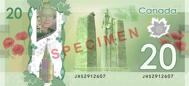
There’s a lot to like about Canadian currency lately, and not just our strength against the Euro. Our “paper” money has been becoming polymer money, as the Bank of Canada shifts us, bank note by bank note. And this November, when this innovation hits our $20 bills, synthetic bank notes will find themselves in the majority of Canadian wallets.
The new notes are mostly well thought out: environmental sustainability (the new bills last 2.5 times longer than paper, and are still recyclable), higher security, reduced costs all around. They may even spread less disease. From a design innovation perspective, they are the first polymer notes ever to include holographic foil.
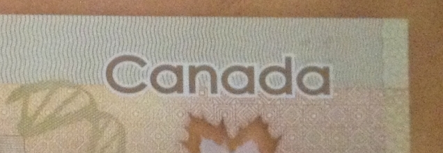
Unfortunately, the part that doesn’t appear to be well-thought through is the cultural sustainability of our national brand. With arguably the world’s most successfully and consistently rolled out national identity program ever, why on Earth would the Canadian Bank Note Company have chosen to shout the word “Canada” in a horizontally stretched abomination of the Avant Garde typeface?
It’s bad enough that the choice of typeface is not consistent with any other branding program we have going for our country. I realize that there are arms-length issues regarding the Canada brand (the same convoluted policy that ensures that all our national Olympic teams are doomed to have dissonant presentations of “Canada” on their uniforms from sport to sport). And if they had to choose an off-brand typeface, could they not have chosen one of the many excellent ones designed by Canadian typographers?
Digitally stretching type, especially on a sans serif like Avant Garde, which is carefully crafted to provide the appearance of a consistent stroke width throughout, is a typographic abomination. Herb Lubalin, perhaps America’s greatest typographer, who published Avant Garde commercially in 1970, would turn over in his grave to see his work so dissed.
Erik Spiekermann reminds us that Frederick Goudy equates letterspacing lower case type as worse than “stealing sheep.” I think those who digitally stretch Avant Garde deserve similar harsh judgment.
That our currency falls short of typographic dignity is symptomatic of a larger issue. It goes beyond bank notes. It goes beyond the lack of respect for the design profession indicated by our Royal Canadian Mint going out to public contest for coin designs. It goes to the heart of what happens when a country lacks a design policy… a chief design officer … the type of respect for how design consistency is design currency, and design currency can be taken straight to the bank of international competitiveness. The kind of design policy that has made South Korea the leading designers and manufacturers of smartphones and TVs worldwide. And did I mention that they have great money too? And the best alphabet on the planet?
Is it too late for the graphic designers of Canada to speak out for the upcoming $20 bills to present our country in a better typographic tone? The new $20 will be released in November and feature the Vimy Ridge Memorial. Perhaps it’s not too late for the accompanying typography to carry similar dignity.
Give your two cents to your Bank of Canada, or your prime minister: (he did well to design think the penny into oblivion … perhaps graphic designer Laureen Teskey would help him agree to fix the twenty.)
…or just express your comments below!
That’s my two cents, anyhow (oy… sorry… couldn’t resist: however imagine how many currency pun I did avoid writing this post!)
Reviewed August 27, 2012

