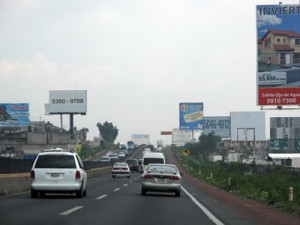
If you ever visit Mexico City, you’ll want to take a day to go see the remarkable Teotihuacan pyramids, a testament to human civilization’s ability to recognize the power of building monumentally visible objects. However on the way you won’t be able to avoid another set of bizarre monuments to the idea that bigger is better: out-of-commission billboards displaying nothing but enormous digits (the phone number of the rental company)… or sometimes simply nothing but arbitrary scrap images.
When I spoke to people of many classes (professors, students, police, taxi drivers, tour guides) regarding whether they found the billboards to be a problem, they all said they strongly dislike them but were used to living with them: a fact of life in the Mexico City skyline. They also said they didn’t imagine anything could ever be done to change them.
One of the upsides of globalization is that we can share examples of design policy from region to region. A global design network can share both hope and ambition as well as best practices and technique.
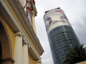
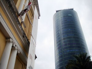
A no-billboards policy like that in Vermont (they banned all outdoor advertising in 1968, inspiring similar legislation in Alaska, Maine, and Hawaii since) did not seem realistic to the Mexicans I explained it to. However when I showed the before and after of what Brazilians did in São Paulo, they were convinced that a cleaner mental environment was possible.
In January 2008, I witnessed the remarkable outcome of an inspiring change along the sprawling São Paulo skyline. The world’s fourth largest metropolis used to have approximately 13,000 billboards, layered so thick that it inspired the extreme advertising portrayed in Terry Gilliam’s 1985 film Brazil. In 2007, São Paulo completely outlawed billboard advertising. Knocking down arguments that loss of lighting from outdoor advertising would make the streets less safe at night (imagine!), Brazil’s largest city banned all billboards on public spaces (including the “rolling stock” the sides of buses and taxis). This required the removal of thousands of ads by the deadline. The result: a 70 percent approval rating from the citizens.
It is our professional responsibility to help everyone recognize that the public environment is precious and sacred and shouldn’t be for sale to the highest bidder. As designers, we should do our part in honouring the landscape and treating it like any other limited natural resource deserving sustainable treatment.
In our our cities, states and countries we can choose to retain the dignity and quality of our public spaces. Everyone enjoys tidier views, where our minds are not continually bombarded by random messages intended to coerce.
Here in Canada, we have our own odd mix of excellent and lame outdoor media policy.
What do you think is the most important thing we can do to improve our outdoor spaces here at home?
(Includes content excerpted from Do Good Design by David Berman (Pearson, 2013))
Reviewed July 9, 2013


